Integrating Aesthetics and Functionality in Web Design.
Julio Arango · 8 min read · Updated August 2026
Two websites fail for opposite reasons. One is beautiful and nobody can find the pricing on it. The other is easy to use and looks like it was built in 2011, so nobody trusts it enough to look for the pricing at all.
Striking the right balance between the two is the central problem of web design, and it is a false choice more often than it looks. This guide covers what each side actually contributes, where they genuinely conflict, and how to get both on the same site.
The Difference Between Aesthetics and Functionality
Aesthetics is how a site looks and feels: layout, color schemes, type, imagery, spacing, motion. It works fast and mostly below conscious attention. Within a few seconds a visitor has decided whether your business looks credible, which is why an aesthetically pleasing first screen is worth the effort.
Functionality is what a site does and how easily: navigation, speed, forms, search, responsive behavior, and whether it is user-friendly at every step. It works slowly, over a whole visit, and it is what someone remembers. Ease of use is the part people describe to a colleague afterwards.
The useful framing is the balance between form and function, borrowed from architecture. A visually appealing design earns the attention. A highly functional site decides what happens with it, and it should scale seamlessly from a phone to a large screen. A visitor who is impressed and then confused leaves with a worse impression than one who was never impressed.
How Each One Shapes User Experience
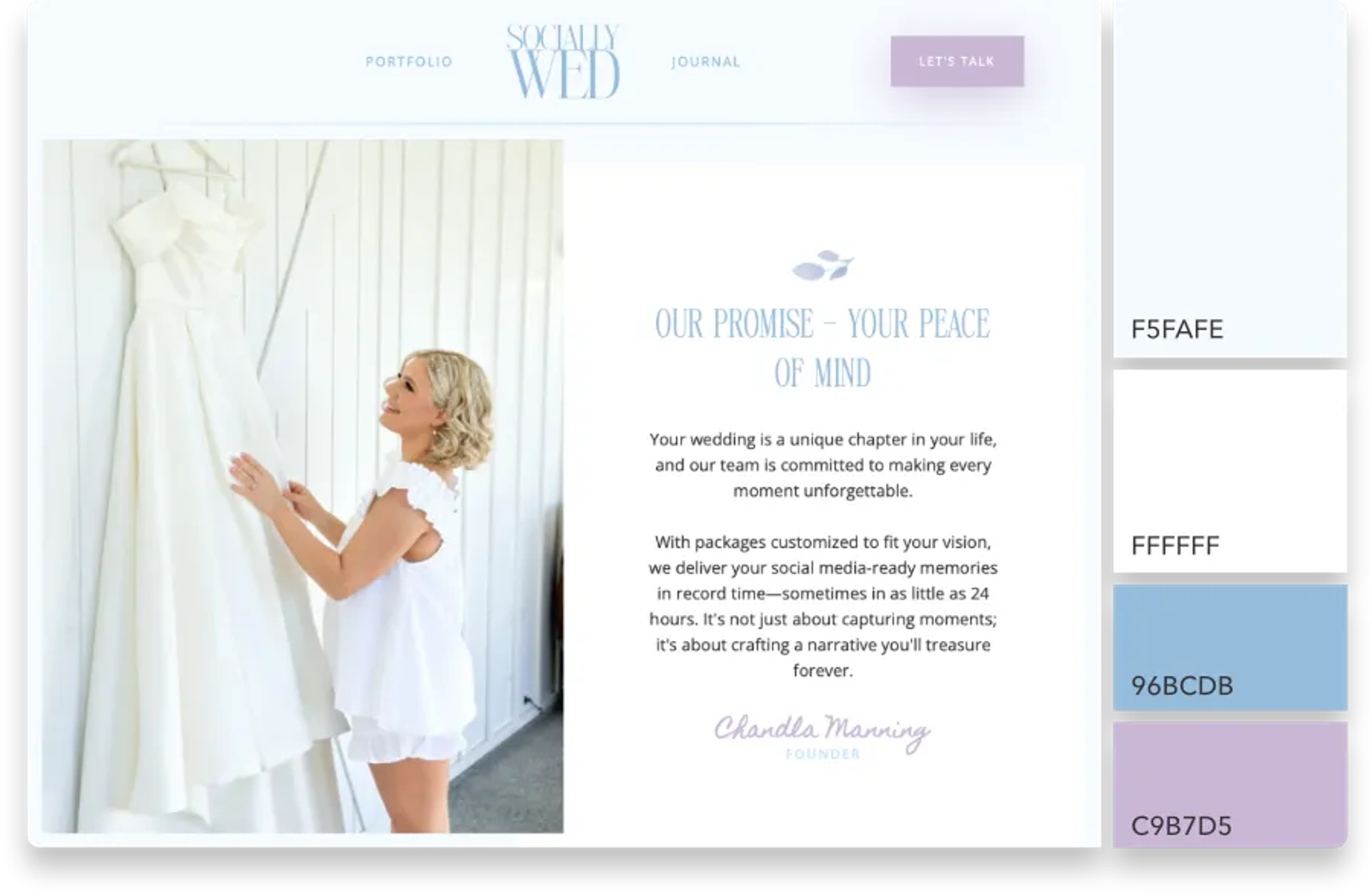
The visual side does three jobs. It signals credibility before anything is read. It carries brand identity, which is why two sites with identical structure can feel like different price brackets. And it directs attention, using contrast and hierarchy to say what matters.
The functional side does three others. It removes friction, so people accomplish their goals through a seamless flow rather than an effortful one. It works everywhere, adapting to different screen sizes and assistive technology without sacrificing anything on the way down. And it performs, because a page that takes four seconds to appear has already lost part of its audience. Nothing damages user satisfaction faster.
There is a well-documented effect where people rate attractive interfaces as easier to use, even when they are not. That is a real advantage and also a trap. Visual appeal buys patience; it does not buy forgiveness. When the aesthetic promise and the actual experience diverge, the gap reads as dishonesty.
The Key Elements of Aesthetic Design
- Layout and visual hierarchy. Where things sit and what the eye reaches first. More decisive for the overall design than any single graphic choice.
- Color. Sets tone and directs attention. Covered in depth in color psychology in web design.
- Type. The largest surface area on most pages, and the design element carrying the most weight. Covered in typography in UX and UI design.
- Imagery. High-quality images that show real work beat stock photography every time for a service business.
- Space. The absence of clutter is a design decision, not an empty area waiting to be filled. Visually pleasing pages are usually emptier than their owners expect.
- Motion. Small, purposeful movement that explains a change of state. Anything longer than about 300 milliseconds starts costing time.
The Key Elements of Functional Design
- Navigation. Structure that is easy to navigate, with labels that use the visitor's words rather than your internal ones.
- Performance. Load times, image weight, and how quickly the page becomes usable rather than merely visible. A seamless user experience is mostly speed.
- Responsive design. One site that adapts to every screen size, tested on a real phone rather than a resized browser window.
- Accessibility. Contrast ratios, keyboard support, alt text, focus states. This overlaps with the visual work far more than most people expect.
- Clear next steps. Every page should make the next action obvious, which is the subject of call to action buttons.
- Content structure. Headings, scannable paragraphs, and information in the order someone needs it. A functional website is one where nothing is difficult to use.
How to Balance Aesthetics and Functionality
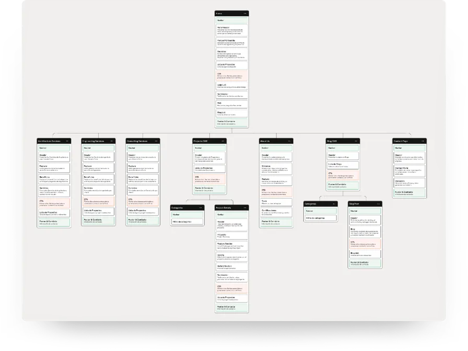
Web designers reach the perfect balance through process rather than taste, not through argument. Six principles, in the order they pay off.
- Decide what the page is for first. Most conflicts between the two dissolve once the page has one job, which starts with knowing which type of website you are building. Arguments about a hero image are usually arguments about purpose in disguise.
- Design the structure before the surface. Wireframes settle the user interface questions cheaply, before web development starts. Applying a design language to a structure that already works is far easier than the reverse.
- Set a budget for beauty. Decide in advance what a full-screen video or a custom font is allowed to cost in load times. A number turns a taste argument into a tradeoff, and lets you improve the overall user experience without compromising the look.
- Treat accessibility as a design constraint, not a review step. Contrast requirements shape the palette. Discovering them at the end means redoing the palette.
- Prioritize on real behavior. Watch someone use the site. The place they hesitate is where you enhance usability first, and everywhere else you have room to be interesting.
- Keep it consistent. A system of repeated components is both cheaper to build and easier to learn, which will enhance the user experience and the look at the same time. That is what the wider design principles are for.
Examples of Good and Bad Balance
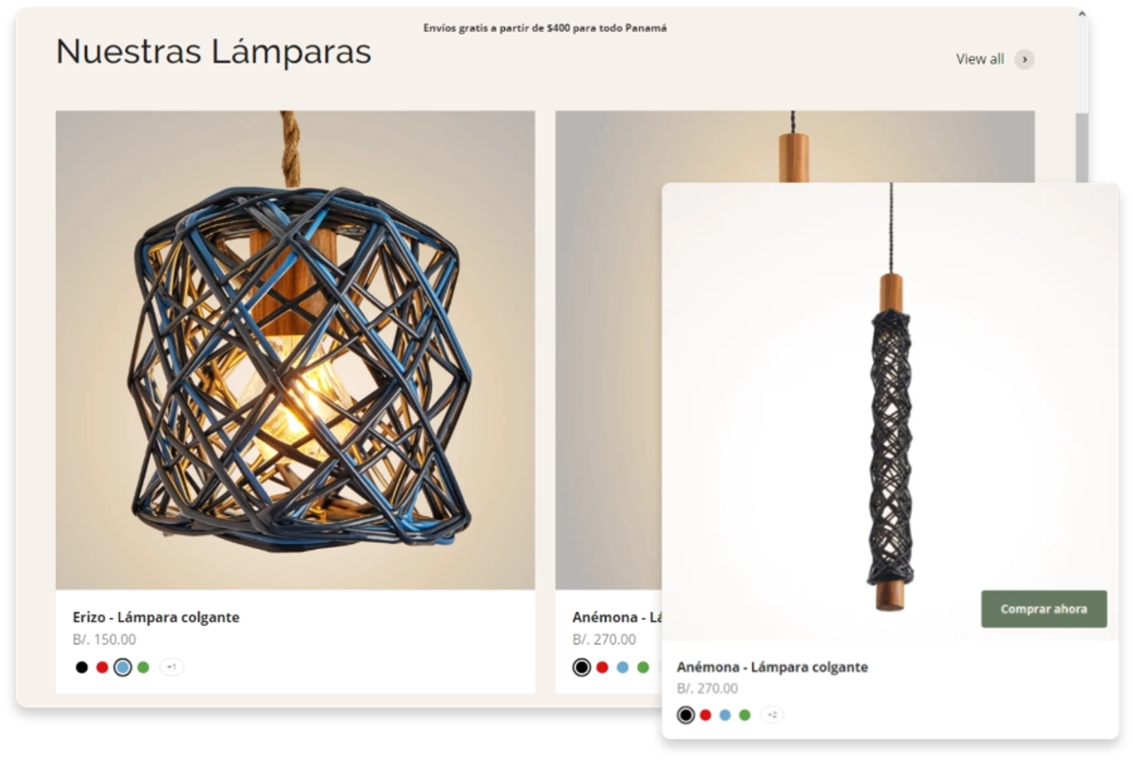
Working well. An e-commerce site that uses large, sharp photography to capture attention, then puts an unmissable add-to-cart button next to the price and keeps checkout to three fields. The visual work does the persuading and the structure does the converting.
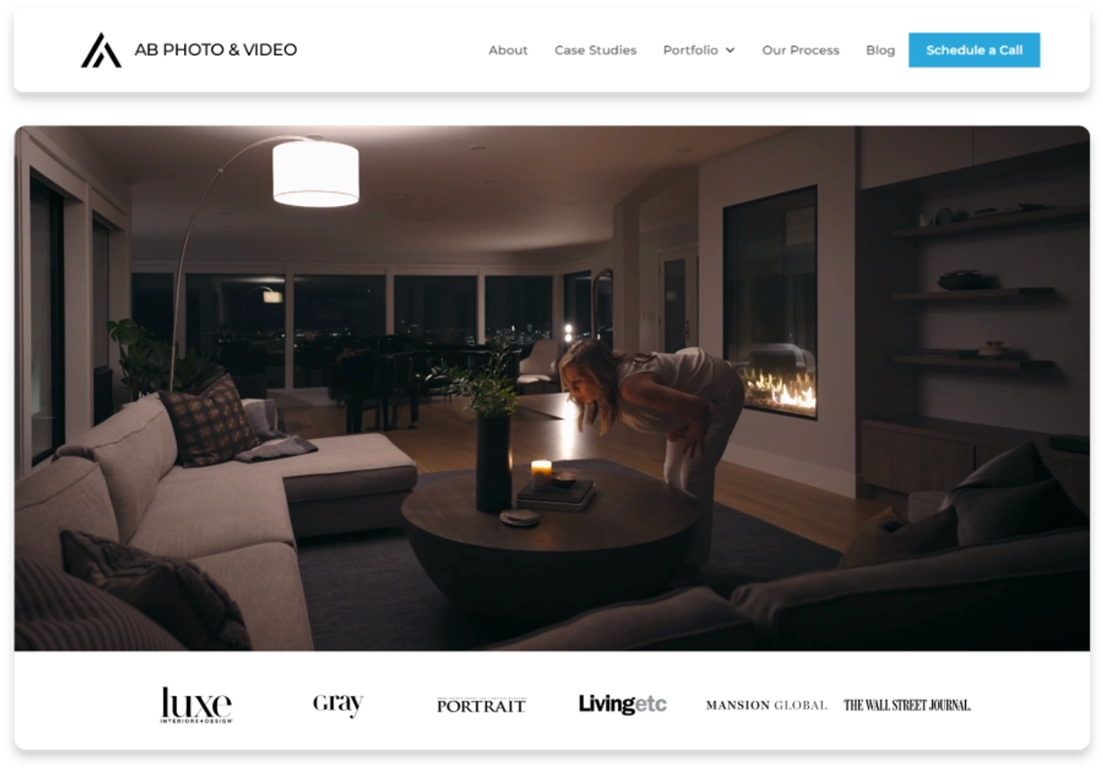
Working well. A photographer's portfolio with a minimal frame and bold pictures, where the menu is three items and the work loads instantly on a phone. The restraint is what makes the images look expensive.
Working badly. A studio site with a full-screen intro animation, the navigation hidden behind an icon on desktop, and light gray body text at 14 pixels. Every decision was defensible in a design tool and each one costs the visitor something.
Working badly. A perfectly usable site with a clear structure, fast pages and a template that a thousand other businesses also use. Nothing is broken and nothing is memorable, which for an expert-led business is its own kind of failure.
Questions About Aesthetics and Functionality
What is the difference between functionality and aesthetics?
One is how a site looks: layout, color, type, imagery. The other is what it does and how easily: getting around, speed, input fields, accessibility. The first earns attention, and the second decides what happens next.
What are the 7 C's of website design?
Context, content, community, communication, customization, connection and commerce. The framework comes from Rayport and Jaworski's work on customer interfaces, and it is a useful audit list because it forces you past visual questions into what the site is actually for.
Can you provide an example of aesthetic functionality?
A button whose color, size and position make it obvious and also give it aesthetic appeal. Or a well-designed navigation bar whose type carries the brand while its labels stay plain. The best cases are where one decision serves both, which is more common than the debate about design and functionality suggests.
What are the four types of aesthetics?
There is no settled list in web design, and the phrase usually arrives from philosophy or from social media style labels. A more useful split for a website is minimal, editorial, expressive and utilitarian. Pick the one that matches what you sell rather than whichever of the design trends is current.
Why is it important to prioritize usability?
Because visual appeal is judged once and ease of use is judged continuously. A site that looks good and works badly converts a good first impression into a bad final one, which is worse than never impressing anyone.
Does a beautiful website actually perform better?
Yes, when the visual work is earning its place: guiding attention, signaling quality, making structure legible. Decoration that carries no information adds weight and load time without adding meaning.
Getting Both on the Same Site
The businesses that solve this treat it as one job rather than two departments. The structure is designed with the visual language in mind, and the visual language is chosen knowing what it has to carry. In a good UX design process you cannot tell which of the aesthetic elements came first.
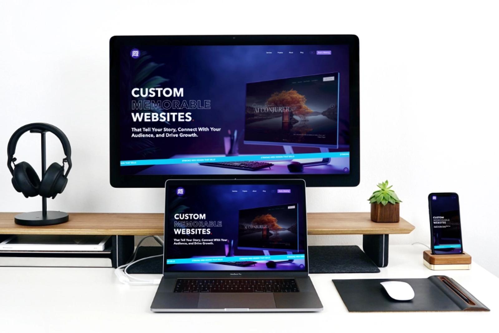
That is how we work at Dancing Pels on Custom Websites: the site is built to look like the caliber of your work and to move a visitor toward a conversation, because a site that only does one of those is only half finished.
If your site is strong on one side and weak on the other, book a discovery call and we will tell you which.