
Color Psychology in Web Design: How to Pick Colors.
Julio Arango · 9 min read · Updated August 2026
A visitor forms an impression of your website before reading a single word. Color is most of what they are reacting to, which makes it the one design decision that starts working before anything else does.
The practice is simple to state: choose colors for the response they produce rather than for how they look on a moodboard. This guide covers what colors mean, how they affect user behavior, how to build a palette, the rules worth following, and where accessibility and culture change the answer.
What Is Color Psychology in Web Design?
Color psychology is the study of how colors affect perception and behavior. Applied to a website, it means every color on the page is doing work: setting expectations, signaling category, directing attention. Use color deliberately and it becomes a communication tool rather than decoration.

Two things are worth separating. Color theory describes how different colors relate to each other, which is mechanical and reliable. The psychology of color describes how people react to them, which is real but softer, shaped by culture, context and what a person has seen before.
Treat the psychology as a strong default rather than a law. Blue is a safe color choice for a financial services site because decades of financial sites have been blue, and expectation is doing as much work as instinct.
How Colors Influence Behavior
The strategic use of color affects three things you can measure.
Attention. Contrasting colors pull the eye. This is why the single most reliable finding in conversion testing is that a button needs to contrast with its surroundings, and why the exact shade matters much less than most articles claim.
Comprehension. Color groups things. Using one highlight for every link teaches a visitor what is clickable in about four seconds, without a word of instruction, which is a real improvement in user experience.
Trust. Colors in web design carry category expectations, and a palette that matches them reduces friction. A palette that fights them makes a visitor work, and work early in a visit is expensive.
Where color changes conversion, it is almost always through the first of those. A red button beating a green one in a famous test says more about the page it sat on than about red. Colors evoke feeling, but contrast is what moves numbers.
Common Color Meanings on the Web
These color associations hold reasonably well in Western markets. Read them as starting points for the emotional response you want, not as guarantees.
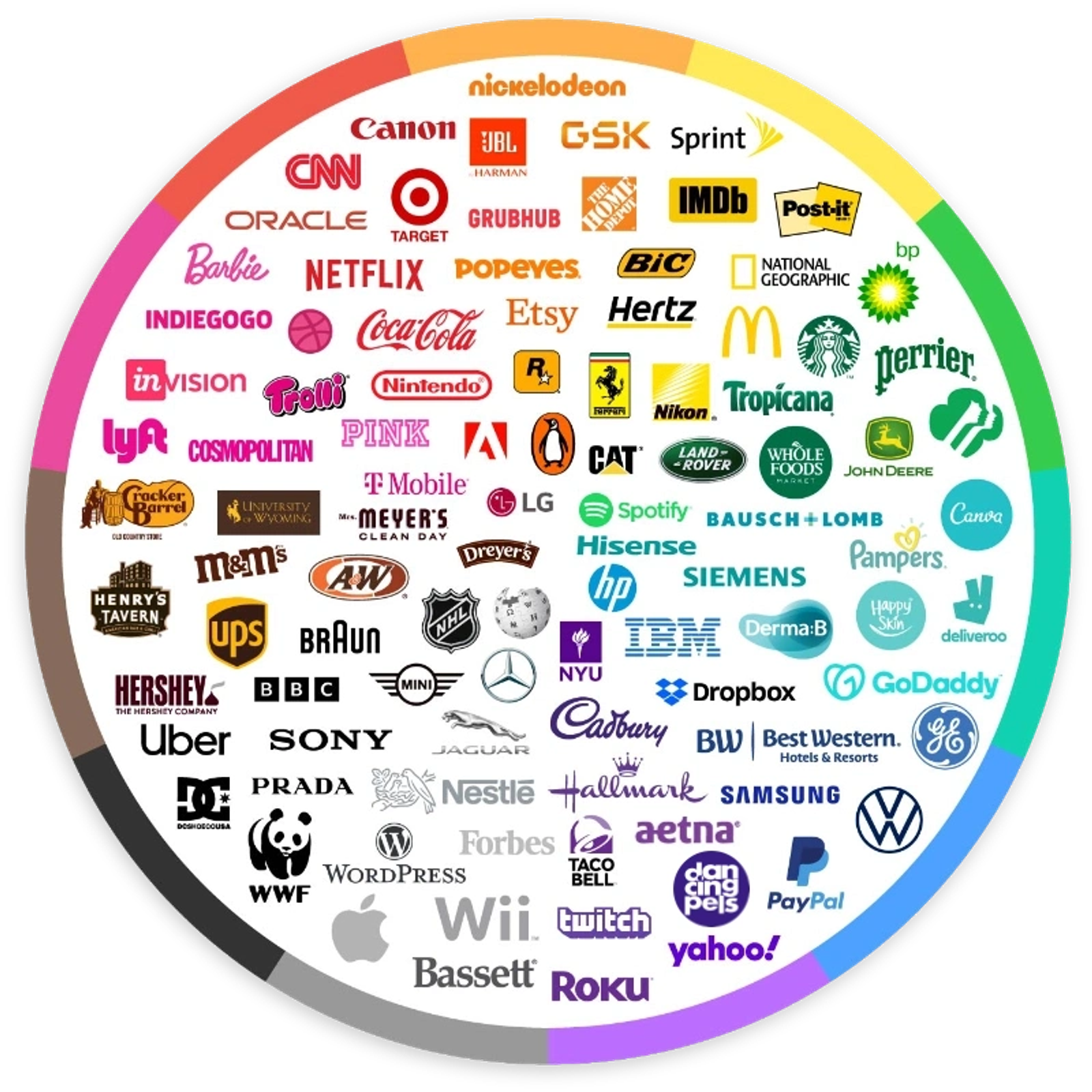
- Blue. Trust, stability, competence. The default for finance, healthcare and software, which is both its strength and its weakness. Red, yellow and blue are the primary colors most people picture, and blue is the one that carries the least risk.
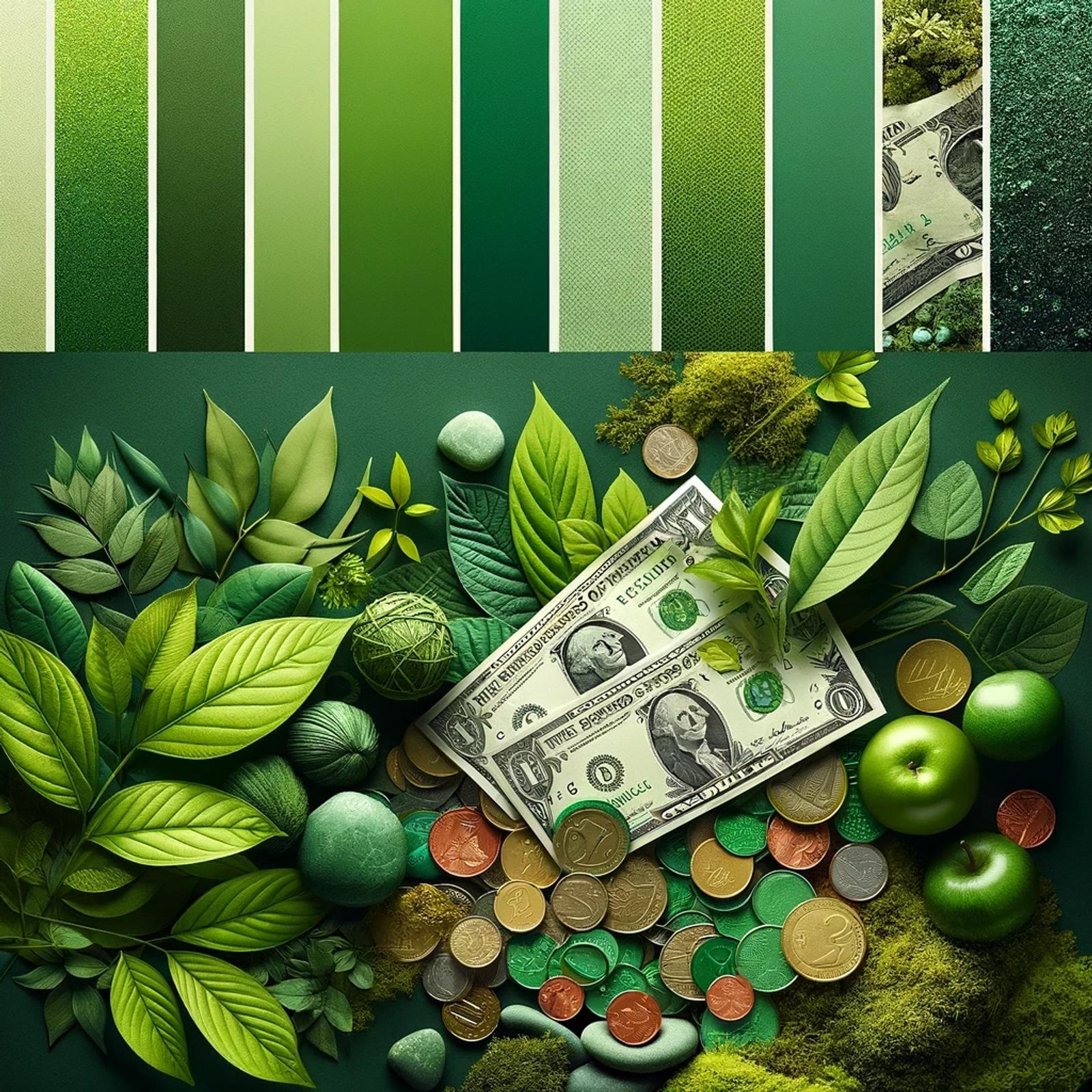
- Green. Growth, health, permission. Strong for wellness, sustainability and anything with a "go" action.
- Red. Urgency, energy, appetite. Effective as an accent, exhausting as a background.
- Orange. Warmth and approachability, with less aggression than red. Common on calls to action for that reason.
- Yellow. Optimism and attention. Difficult as text at almost any size because of low contrast.
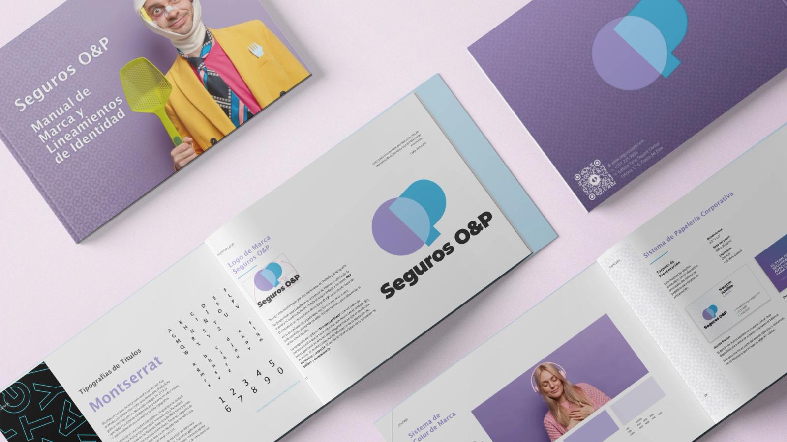
- Purple. Craft, imagination, premium positioning. Less used, which makes it easier to own.
- Black. Authority and luxury, entirely dependent on the typography around it.
- White and neutrals. Space and clarity. The colors that make the other colors work.
The Color Theory Terms You Actually Need
The wheel is the map, and four color combinations cover most decisions.
- Complementary colors sit opposite each other on the wheel and produce maximum contrast. Useful for an accent, punishing in large areas.
- Analogous colors sit next to each other and produce harmony with low tension. Good for backgrounds and calm interfaces.
- Triadic uses three colors evenly spaced, which gives variety while staying balanced.
- Monochromatic uses one hue at different values, which is the easiest way to look deliberate.
Two more terms earn their place. Warm colors such as red, orange and yellow advance toward the viewer; cool colors like blue and green recede. Used strategically, that difference alone builds depth on a flat screen. And saturation is the dial most beginners leave too high. Muting saturated colors slightly is the quickest way to make a palette look professional.
Screens use the RGB color system, which matters because a color that looks right in print can look wrong on a display, and because the same hex value shifts between monitors.
How to Choose a Color Palette for a Website
1. Start from the brand, not the trend
Your website color should come from your brand identity, not from what looked good on a design gallery this month. A web designer who starts anywhere else is decorating. If the brand has no defined palette, that is the problem to solve first.
2. Pick one dominant color
Your dominant color sets the tone and should be the one people associate with you. Pick it for distinctiveness within your category as much as for meaning. If every competitor is blue, being blue makes you invisible.
3. Add one accent
An accent color exists to be pressed. It should contrast hard with the base and appear rarely, because a color used everywhere emphasizes nothing. This is the color your call to action buttons will use.
4. Build a neutral range
Most of your site is neutral. Two grays, a near-black and an off-white will carry more surface area than the brand colors ever do. Getting these neutral colors right is what separates a designed site from a colored one.
5. Test before you commit
Audiences react differently, so run the palette past real users and A/B test the pages that matter. Design tools such as Adobe Color and Coolors help with selecting a color scheme quickly, but they cannot tell you what your buyers respond to.
Color Rules Worth Knowing
The 60/30/10 rule. Sixty percent dominant color, thirty percent secondary, ten percent accent. Borrowed from interior design and the most useful proportion rule there is, because it forces the accent to stay scarce.
The three-color rule. Limit a design to three colors plus neutrals. Not a law, but a good constraint. Palettes go wrong by addition far more often than by subtraction.
The 70/20/10 rule. The same idea with a larger neutral base, common when the design leans minimal. Pick whichever proportion you will actually hold to.
Accessibility and Culture
Two constraints override aesthetics.
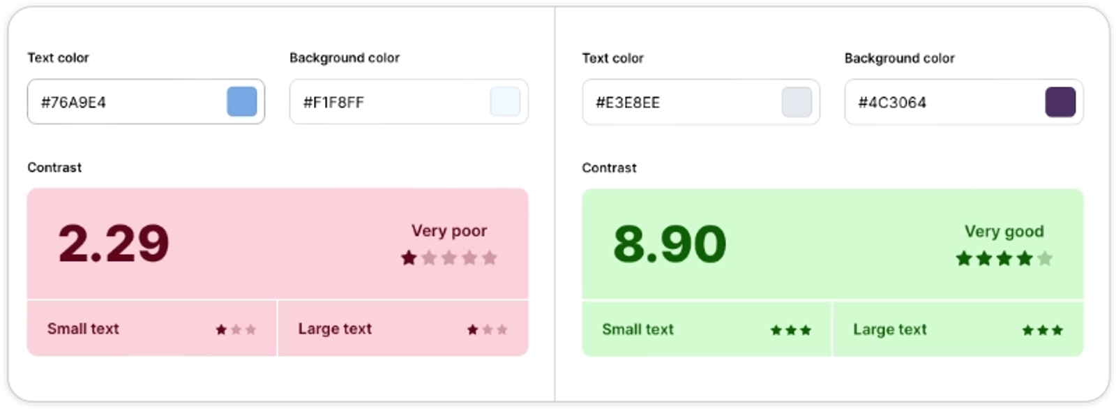
Contrast. Body text needs a contrast ratio of at least 4.5:1 against its background, and large text at least 3:1, to meet WCAG AA. Around one in twelve men has some form of color vision deficiency, which is also why color alone should never carry meaning. If red means error, the word "error" needs to be there too.
Culture. Meanings shift across markets. White signals purity in much of Western culture and mourning in parts of Asia. If you sell across regions, check before committing.
Current Color Trends

Current color schemes worth knowing, with the caveat that a trend is a rented look:
- Bold and saturated. Use bright oranges against deep blues, or greens against purple. Loud and memorable.
- Muted and pastel. Soft, minimal, common in wellness and beauty.
- Monochromatic. One color, many values. Simple and hard to get wrong.
- Nature-inspired. Earthy greens, ocean blues, sand. Reads as calm and considered.
- Gradients. Depth in backgrounds and overlays.
- High-contrast dark. Bright accents on near-black, which reads as technical and current.
- Duotone. Two colors doing everything, which is bolder than it sounds.
Use trends for accents. Keep the core palette timeless, because a rebrand every eighteen months costs more than it earns. Effective color schemes outlast the year they were chosen in.
Questions About Color in Web Design
What is the 60/30/10 rule in web design?
Split the design sixty percent dominant color, thirty percent secondary, ten percent accent. It is a proportion guide rather than a rule, and its value is that it keeps the accent rare enough to still mean something.
What is the 70/20/10 rule for colors?
The same idea with a larger neutral base and a smaller accent. It suits minimal designs. The exact numbers matter less than committing to one ratio and applying it consistently.
What is the three-color rule in web design?
Use no more than three colors, plus neutrals. It is a constraint that prevents the most common palette failure, which is adding one more color to solve a problem that was actually about hierarchy.
What are the 7 types of color theory?
Different sources count differently, and most lists cover the standard color schemes: monochromatic, analogous, complementary, split-complementary, triadic, tetradic and square. They describe positions on the color wheel, not different theories.
How do I pick the right color for my website?
Start with your brand, check what your category already looks like, pick a key color that distinguishes you within it, add one accent that contrasts hard, and build a neutral range that carries most of the page. Then test it.
Does color really affect conversions?
Contrast does, reliably. Individual colors do, but far less than the case studies suggest, because the winning color in any test is usually just the one that stood out most on that particular page. Use contrasting colors and most of the effect is already yours.
Getting Color Right on Your Own Site
Color decisions are cheap to make and expensive to undo, because everything in your website design afterwards inherits them. That is why it matters in web design more than most single choices do. The businesses that get it right treat the palette as part of the brand rather than as a stage in the design process.
That is how we work at Dancing Pels on Custom Websites: the palette comes out of the positioning, gets tested against contrast requirements, and becomes a system the rest of the site is built on. Holding it steady across every channel afterwards is a matter of brand consistency.
If the colors on your site were chosen years ago and nobody remembers why, book a discovery call and we will take a look.