Call to Action Buttons: Best Practices and Examples.
Julio Arango · 11 min read · Updated August 2026

In one widely cited HubSpot test, changing a CTA button from green to red lifted clicks by 21 percent. Nothing else on the page moved. The test says less about red than it does about contrast, and it makes the wider point well: the button is where a visitor either acts or leaves, and small decisions there carry more weight than almost anything else on a web page.
This guide covers what a CTA button is, the types you will use, the design rules behind an effective CTA, the phrases that work, real examples by scenario, and how to test what you ship.
What Is a Call to Action Button?
A CTA button is a clickable element that asks a visitor to take one particular action: book, buy, download, or subscribe. It exists to guide users toward the desired action, and it is the point where interest becomes a measurable step.
Three parts make up any CTA button. The copy states what happens next. The design makes it findable. The placement decides whether the visitor meets it at the moment they are ready. When people say a CTA underperformed, the cause is usually one of those three rather than the offer itself.
The wider term "call to action" covers any prompt, including a line of text or a link. A button is the strongest version because it looks pressable, which removes a small decision from the visitor and improves the user experience on the way through.
Why CTA Buttons Matter for Conversion
Every page has a job. The CTA button is where that job either happens or does not.
- It converts attention into action. Traffic that never reaches a button is just traffic, and conversion rate is measured at the moment someone decides to take action.
- It sets expectations. A good call-to-action such as "Book a discovery call" tells the visitor exactly what happens. Ambiguity is the most common reason website visitors hesitate, and clarity is what moves a user to click.
- It guides users through the conversion funnel. Different pages call for different asks. A blog post earns a newsletter signup; a service page earns a call.
- It is the cheapest thing to improve. Rewriting a button takes minutes. Improving the traffic that reaches it takes months.
For an expert-led service business the main ask is usually a conversation, not a purchase, which changes the tone. Pressure works against you when the next step is a meeting with a human being.
Types of CTA Buttons
Knowing which kinds are available makes it easier to pick the right one for each page.
- Primary action. The one thing you most want from this page. Book, buy, start.
- Secondary action. A lower-commitment alternative for visitors who are not ready. See pricing, view work, read the case study.
- Lead generation. Trades something useful for contact details: a guide, a checklist, a template.
- Trial or demo. Standard in software, where the product can sell itself once someone is inside.
- Ecommerce. Add to cart and buy now, where the button sits beside the product rather than at the end of an argument.
- Content and subscription. Read more, subscribe, follow.
- Social proof buttons. A call to action that carries evidence in the label or immediately beside it.
Most pages need one primary CTA and at most one secondary. Multiple CTA buttons competing at equal weight is the fastest way to reduce the clicks you get on any of them. Decide which one your target audience needs most and let the others recede.
CTA Best Practices for Buttons
Write the copy first
The words do more work than the design. Start every label with an action verb and name the outcome the visitor gets.
Generic labels like "Submit" describe what the form does. Specific labels describe what the person receives. "Download the pricing guide" beats "Submit" because it answers the only question a visitor has at that moment: what happens if I press this? You want one step taken, and you want the visitor to know exactly what that step is.
A widely cited test by Michael Aagaard found that switching a button from "Get your free template" to "Get my free template" raised clicks by 90 percent. First-person phrasing puts the words in the visitor's own voice, which is a small change with an outsized effect.
Keep labels to two to five words. Anything longer stops reading like a button, and the words or phrases you cut are almost always the ones describing you rather than the action you want.
Make the button obvious
Button design has one job before it has any others: be unmistakably pressable and impossible to miss.
- Use a color that contrasts with everything around it. The particular hue matters far less than the contrast, and contrast is what prompts immediate action.
- Give the button generous padding, so it reads as a target rather than a label.
- Keep the shape consistent everywhere, so visitors learn what a button looks like on your site.
- Check the contrast ratio for accessibility. A button nobody can read converts nobody.
Color carries meaning as well as attention, which we cover in color psychology in web design.
Size it against the page, not in isolation
A button that is too small gets skimmed past. One that dwarfs the content around it reads as an advertisement and gets ignored for the same reason banners do.
The test is hierarchy. Your primary CTA should be the most visually prominent interactive element on the page, and the secondary one should be visibly quieter. That hierarchy is what points people toward the specific action that matters most. On mobile, any tap target below roughly 44 pixels is a source of missed taps.
Place it where the decision happens
Placement above the fold works when the visitor already knows what you do. For anything that needs an argument first, the button belongs at the end of that argument.
The practical answer for a long page is both: one near the top for returning visitors, and one after each section where a reader might be persuaded. Repeating the same primary CTA down a long page costs nothing and catches people at different moments, each one a fresh chance for a reader to take the desired action.
Give each page one job
Two equally weighted buttons split attention. A single call-to-action per page, repeated as needed, consistently outperforms a page offering four equally plausible next steps.
Remove friction around the button
Everything immediately around a button either supports it or undermines it. A short line of reassurance underneath, such as "30 minutes, no obligation", answers the hesitation that stops people mid-press. That reassurance is often what prompts a user to take the step.
Create urgency only when it is real
A genuine limited time offer or a real capacity limit will create a sense of urgency honestly. Manufactured urgency on a service website reads as pressure, and pressure is expensive when the next step is a conversation with a person. A false sense of urgency also costs you the second visit.
Call to Action Phrases That Work
These action words and lines do well because each one states a particular action and its result. Each is a good call to action for the same reason: it tells the reader what they get.
- Book a discovery call
- Get my free guide
- Start your free trial
- See how it works
- Get a quote
- Download the checklist
- Reserve your seat
- Talk to a specialist
- Show me the pricing
- Get started today
Notice what they share. Each opens with a strong verb, each describes what the person receives, and none of them says "Click here." The words and phrases that fail are the ones that describe the mechanism rather than the reward.
Call-to-Action Examples by Scenario
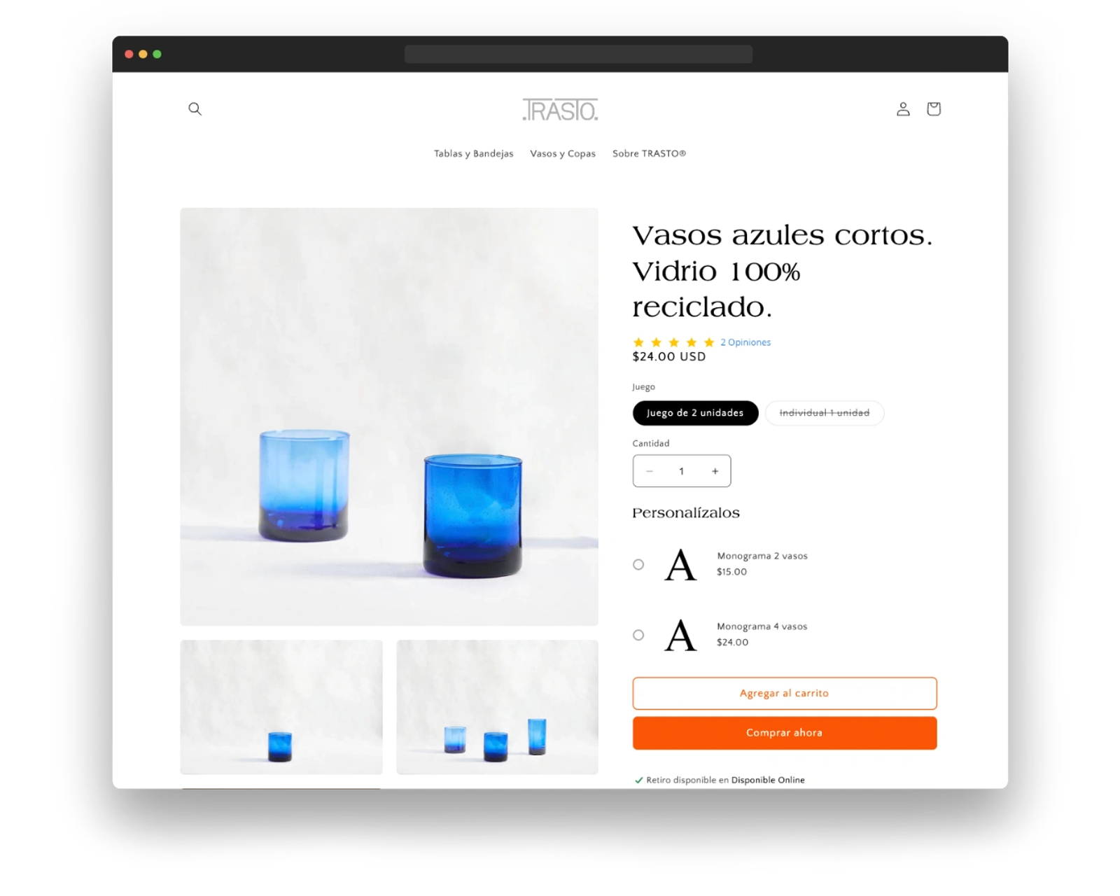
Ecommerce. Place "Add to cart" beside the product image and price, where the decision to make a purchase is actually made. Use a contrasting color, and reserve urgency for facts you can back up, such as genuine low stock.
Lead generation. Position the button at the end of a persuasive landing page or blog post, name the asset in the label, and put social proof immediately beside it. In a paid marketing campaign this is the single element worth testing first. "Join 10,000 subscribers" works because it is evidence, not an adjective.
Webinars and events. "Reserve your seat" above the fold, since the visitor already knows what they came for. Capacity limits are one of the few places where limited availability is literally true.
SaaS. "Start my free trial" in a prominent location, with the terms stated underneath. Removing the credit card requirement usually moves this number more than any button change.
Expert-led service business. "Book a discovery call" beats "Contact us" every time, because it names the format and the commitment. It is an effective call to action precisely because it is small and specific. A visitor who knows it is a 30-minute call is deciding about a calendar slot rather than an unknown, which makes it far easier to take the next step.
How to Test and Optimize CTA Button Performance
Every claim above is a starting hypothesis. Your page is the only place any of them get settled.
Measure the right two numbers. Click-through rate calculates the number of clicks against the times the CTA was seen, and tells you whether the button works. Conversion rate tells you whether the offer behind it does. A button can win on one and lose on the other, which usually means the label promised something the next page did not deliver.
Change one thing at a time. Copy, then color, then placement. Testing three at once tells you something moved without telling you what.
Give a test enough traffic to mean something. Most small business sites cannot reach statistical significance in a week. Where traffic is thin, prefer larger changes that produce obvious differences over one-word tests you can never resolve.
Watch the recordings. Session recordings and scroll maps show whether people reach the button at all. Weak numbers on a button nobody scrolls to are a placement problem wearing a copy problem's clothes.
Common CTA Button Mistakes
- Using "Submit" or "Click here", which name the mechanism rather than the reward. Both fail the same way: no strong action, no named result.
- Placing five equally weighted buttons on one page.
- Choosing a color that matches the brand palette so closely it disappears.
- Hiding the primary CTA below three screens of copy.
- Asking for a large commitment from a first-time visitor.
- Sending people to a page that does not repeat the promise the button made.
- Leaving the mobile version at desktop proportions.
Questions About CTA Buttons
What is a CTA example?
"Start your trial" on a software homepage, "Add to cart" on a product page, and "Book a discovery call" on a service website are all standard examples of CTAs. Each call to action example names an action and what the visitor gets.
What are the different types of CTAs?
Primary and secondary actions, lead generation offers, trial and demo requests, ecommerce buy buttons, subscription prompts, and buttons that carry social proof. Most pages need one primary CTA, with a secondary option for visitors who are not ready yet.
What are the best CTA buttons to use?
The right one is the one that matches where the visitor is. Early on, offer something low-commitment such as a guide or a walkthrough. Later, ask for the meeting or the purchase directly. Matching the ask to the moment matters more than the wording.
What are the top 10 call-to-action phrases?
The list above covers the ones that hold up across industries. What they have in common is a strong verb plus a named outcome, kept to a handful of words.
What colors work best for CTA buttons?
Contrast beats any specific color. Red performs well in tests mainly because it usually contrasts hardest with the page it was tested on. Pick a color your design does not otherwise use, then check that its contrast ratio passes accessibility standards.
Where should a CTA button go?
Above the fold for visitors who already know what you do, and immediately after the argument for everyone else. On a long page, use both and repeat the same primary CTA rather than introducing new ones.
Where the Button Fits in the Bigger Picture
A better button improves a page. What improves a business is a site where every page has one obvious next step and they all lead somewhere sensible.
That is part of what we do at Dancing Pels through Custom Websites: pages built around a clear primary CTA instead of decorated after the fact. Filling those pages with the right visitors, and testing what they do once they arrive, is Growth Marketing.
If your traffic is fine and the conversions are not, book a discovery call and we will look at the pages together.