Typography in UX and UI Design: The Rules That Matter.
Julio Arango · 8 min read · Updated August 2026

Designer Oliver Reichenstein made the case years ago that web design is 95 percent typography. The number is an argument rather than a measurement, and it holds up: text is most of what a website is, which makes type the largest design decision on almost every page and the one most likely to be settled in ten seconds from a dropdown.
This guide covers what typography is in UI design, the difference between typography, typefaces and fonts, the elements that actually change readability, how to pick one, and the practices worth applying before anything else.
What Is Typography in UI/UX Design?
Typography is the art of arranging type so that written content is legible and appropriate to its purpose. That last word carries most of the weight: type that suits a banking dashboard would be wrong on a children's app, even if both are perfectly readable.
It works on two levels at once. As visual design, a typeface sets tone before a single word is processed. As a functional system, size, spacing and hierarchy determine how quickly a user finds what they came for and guide users to the next step. That is the whole of the user experience on a text-heavy page.
Typography, Typefaces and Fonts
These three get used interchangeably and mean different things.
- Typeface is the design: Helvetica, Georgia, Times New Roman. It is the shape of the letters.
- Font is a specific instance of that design: Georgia Bold at 16 pixels. A different font is a different weight or size of the same face.
- Typography is what you do with them.
The distinction is not pedantry. Picking the family is a brand decision. Deciding how you use fonts within it, at which sizes and weights, is a systems decision. Different problems, usually different moments.
Why Typography Matters

It decides whether people read at all. A user who has to work for the first sentence often does not reach the second. Poor readability shows up in analytics as a short session, which usually gets blamed on the content.
It builds visual hierarchy. Size, weight and spacing tell users what to read first without any instruction. This is the fastest way to make a dense screen feel simple.
It carries the brand. Type is one of the few design elements present on every screen. Consistency across the whole site does more for recognition than a logo does, because people see it more often.
It affects accessibility. Size, contrast and line length determine whether users with low vision or dyslexia can use the product at all. The importance of this grows with your audience.
The Key Elements of Typography
These are the pieces that change how text performs.
- Typeface choice. The starting decision, and the one that constrains everything after it.
- Font size. Body text below 16 pixels on the web is a common and avoidable mistake. Headers need a clear step up, not a small one.
- Line height, or leading. The vertical space between lines. Roughly 1.5 times the text size for body text. Tight leading is the single most common cause of copy that feels hard to read.
- Line length. Between 45 and 75 characters per line. Longer and the eye loses its place returning to the left margin.
- Letter spacing, or tracking. Slightly loosen it on uppercase and small text, tighten it on large display type.
- Kerning. The space between two specific letters, adjusted individually. Usually only relevant in logos and headlines.
- Font weight. Two or three weights is enough for most interfaces. More weights means more decisions and less contrast between them.
- White space. The space around text is part of the typography, not the background. It does as much for readability as any font choice.
- X-height. The height of a lowercase x relative to the capitals. A large one keeps a face readable at small sizes, which matters on mobile.
Typeface Classifications
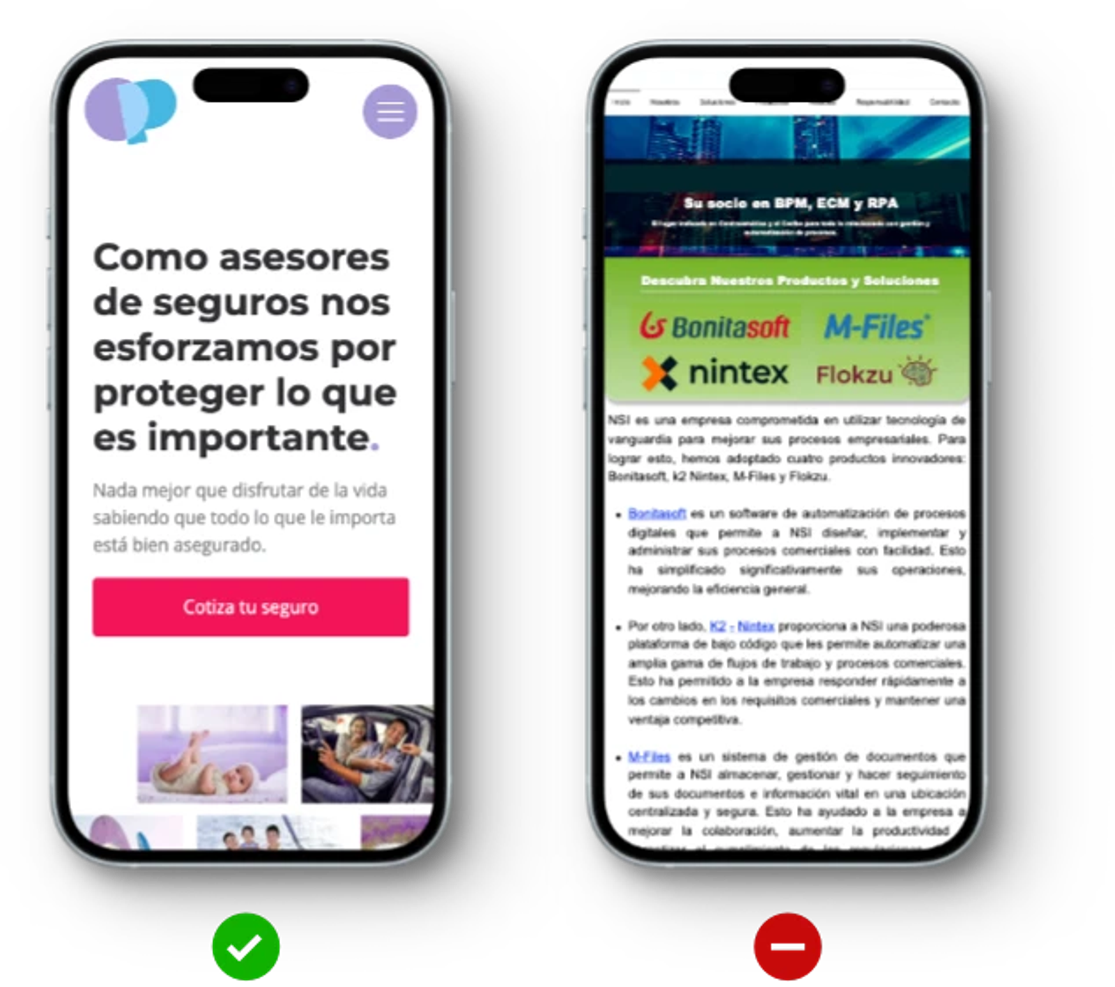
Five categories cover almost everything you will use.
- Serif. Small strokes on the ends of letters. Reads as traditional, editorial, authoritative. Good for long-form text. Slab variants, with heavy rectangular strokes, are strong in headlines and rarely comfortable in paragraphs.
- Sans-serif. No strokes. Reads as modern and neutral. The default for screens because it stays clean at small sizes.
- Script. Handwriting. Use sparingly, and never for anything a user must read quickly.
- Display. Built for large sizes and personality. Excellent at 72 pixels, unusable at 16.
- Monospace. Every character the same width. Correct for code and data, deliberate everywhere else.
The old rule about which of these reads better on screen came from an era of low-resolution displays. On modern screens a well-made serif font is perfectly comfortable, so pick by tone and by the quality of the family rather than by that rule.
How to Choose a Typeface
- Start from the brand. The typeface should say what the brand identity says. A precise, technical business and a warm, personal one need different letterforms.
- Check the family. A font family with only two weights will run out of room the moment you build a real interface. Look for at least regular, medium and bold, plus italics.
- Test it at the sizes you will actually use. Many different typefaces look excellent at 48 pixels and fall apart at 14.
- Limit yourself to two. One for headings, one for paragraphs, or a single family used across both. Extra choices multiply quickly and stop looking intentional.
- Check performance. Every extra weight is a file the browser downloads. Self-hosting and subsetting keep that cost down.
Our guide to choosing a font for your website goes deeper on the selection itself.
Best Practices Worth Applying
- Build a type scale, not a list of sizes. Four or five steps, defined once, used everywhere. This is what makes a large site feel coherent.
- Set the paragraph style first. Everything else is relative to it. Designers who start with the hero headline end up with body text nobody planned.
- Left-align paragraphs. Centered and justified text both slow reading. Center headings if you like; leave the rest alone.
- Give text room. Increasing line height and margins is usually a better fix than changing the typeface.
- Keep contrast high. Light gray text on white looks refined in a mockup and fails on a real screen in daylight.
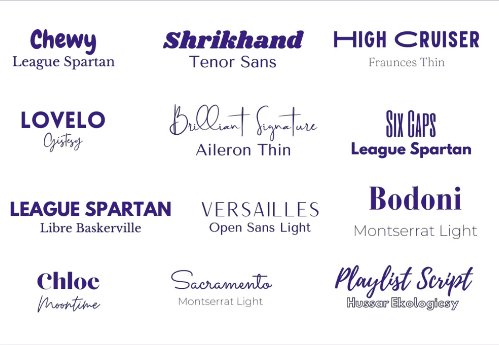
- Make it responsive. Line length and type size both need to change between a phone and a desktop. A layout that only works at one width is not finished.
- Test with real content. Lorem ipsum hides every problem that real headlines create, and it flatters the overall design in a way the live site never will.
Questions About Typography
What is typography in UI and UX design?
It is the arrangement of type so a user interface is clear and appropriate. In practice it means choosing typefaces, setting a size scale, defining spacing, and building a hierarchy that tells users what to read first.
What are the five types of typography?
Most lists give serif, sans serif, script, display and monospace. Slab is often added as a sixth. The labels vary; what matters is knowing which category suits paragraphs and which is built for headlines.
What are the four types of typography?
The shortest version is the same list without monospace, which is treated as a specialist case. Any of these is a starting vocabulary rather than a taxonomy worth arguing about.
What are the five main rules of typography?
Use a limited number of typefaces. Set paragraphs at a comfortable size. Give lines enough space and keep them short enough to scan. Build a clear hierarchy. Maintain contrast. Almost every typography problem is one of these five being ignored.
What is the difference between kerning, leading and tracking?
Kerning is the space between two specific letters. Tracking, or letter spacing, is applied evenly across a run of text. Leading, or line spacing, is the vertical gap between lines. Kerning is per pair, tracking is per block, leading is per line.
Why is typography important?
Because it governs whether content gets read. Every other decision assumes a user is reading the words, and good typography is what makes that likely.
Where Typography Stops Being a Detail
On a marketing site the type system is not decoration. It is the mechanism that decides whether a prospect who arrives curious leaves informed.
That is part of what we build at Dancing Pels through Custom Websites: a type scale, a spacing system and a hierarchy defined once and applied to every page, including the ones written after launch. It sits alongside the wider design principles that govern the rest of the layout.
If the text on your site is technically fine and still nobody reads it, book a discovery call and we will look at why.