
How to Choose the Right Font for Your Website and Brand.
Julio Arango · 12 min read · Updated August 2026
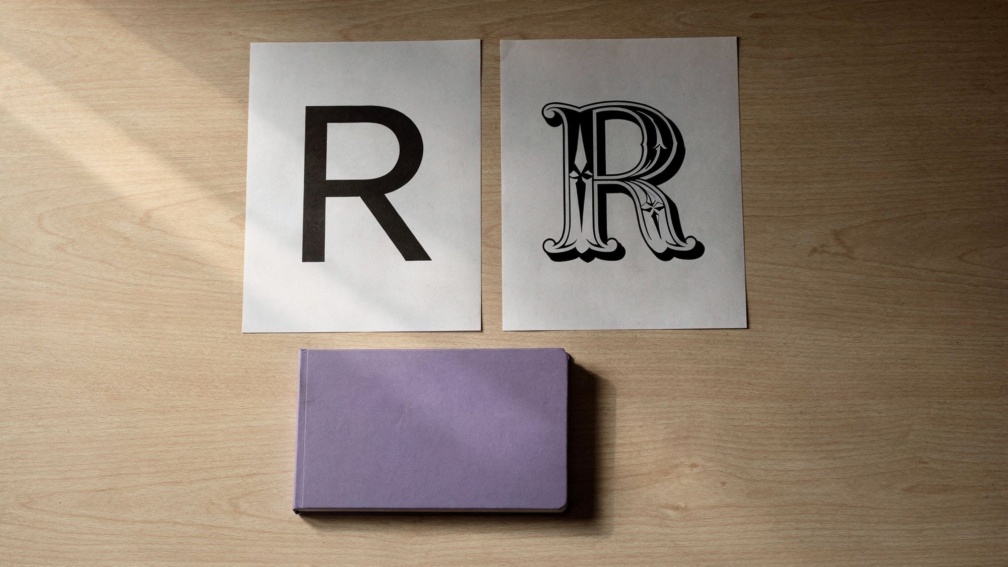
The font you choose is the first thing a visitor reacts to and the last thing most business owners think about. It sets tone before a word is read, and because text is most of a website, the font choice touches more of the page than any other design decision.
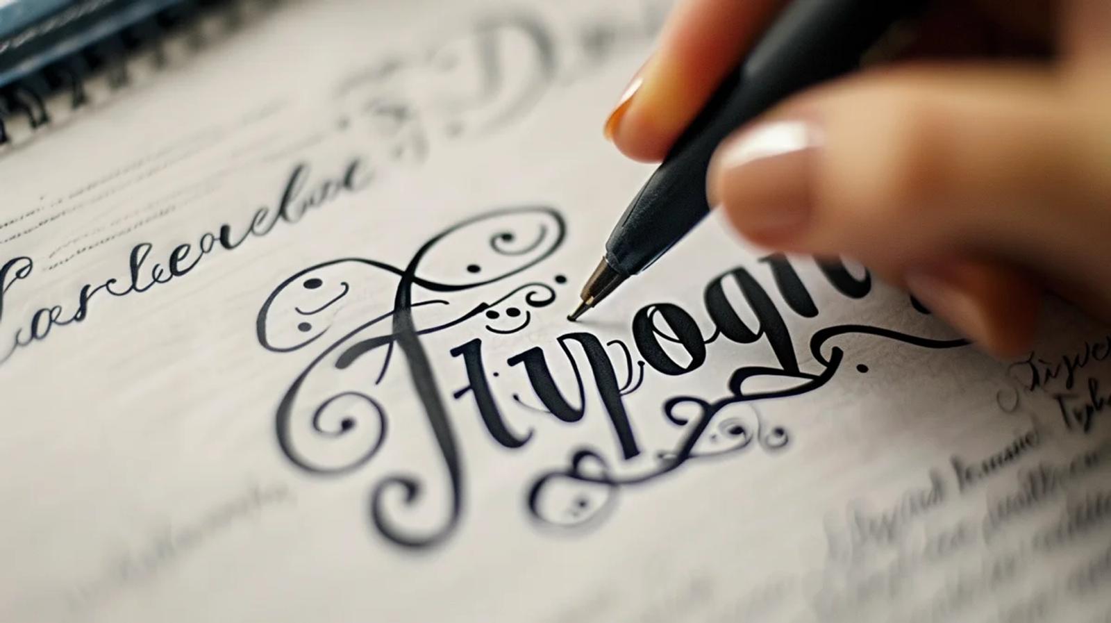
This guide covers the different types of fonts for websites, how to choose a font that fits your brand, how to pair fonts, how many to use, and the best fonts for websites when you want something safe and good. It is written for someone designing your website themselves or briefing whoever is, and the tips for choosing the right typeface apply either way.
Font, Typeface and Family: The Words You Need
Three terms get used interchangeably. Getting them straight makes every conversation with a designer shorter.
- A typeface is the design itself: Helvetica, Georgia, Times New Roman.
- A font is one instance of it: Georgia Bold at 16 pixels.
- A font family is the full set of weights and styles in one typeface.
In practice most people say font for all three, and nobody minds. What matters is that when you pick a typeface you are choosing a whole system, and a family with only two font weights will run out of room the moment you build a real site.
The Different Types of Fonts for Websites
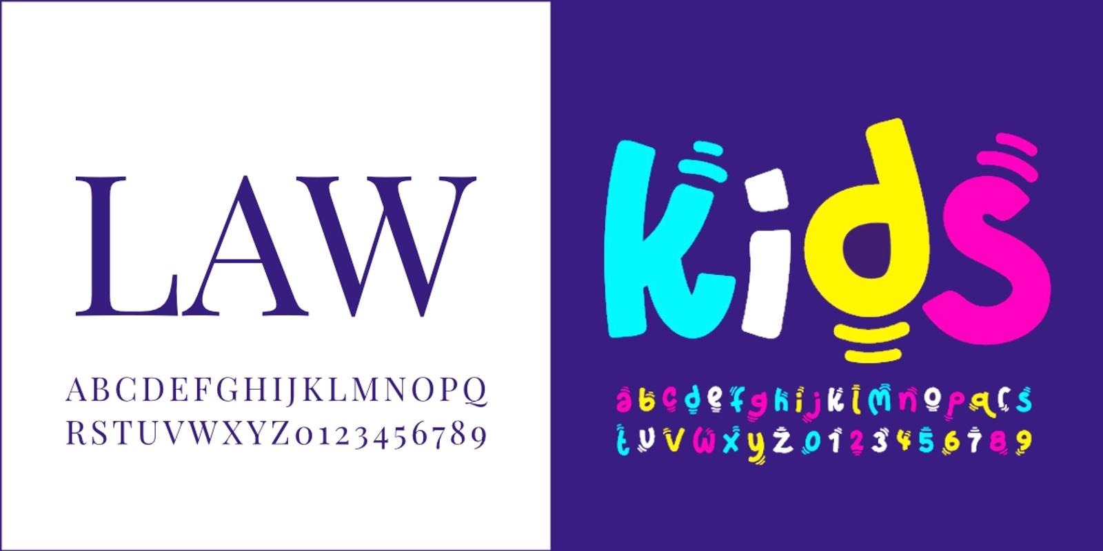
Six categories cover almost everything.
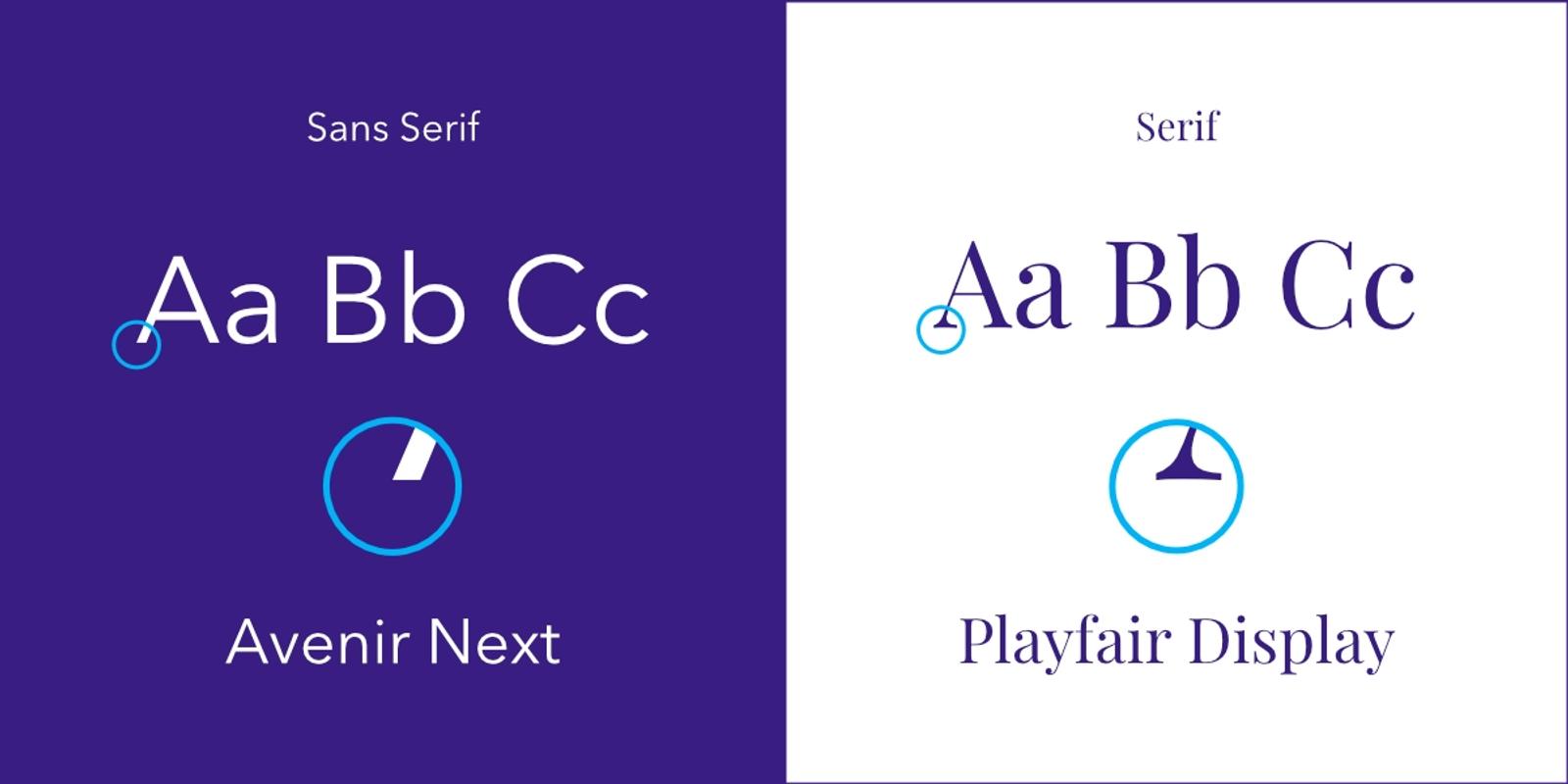
Serif. Small strokes on the ends of the letters. A serif typeface reads as established, editorial and trustworthy, which is why law firms and newspapers lean on it. Serif fonts like Georgia, Merriweather and Garamond work well for body copy.
Sans serif. No strokes, cleaner shapes. A sans serif font is the default for interfaces because it stays legible at small sizes and is easy to read on any screen. Helvetica, Arial, Roboto, Open Sans and Lato are the most popular font choices here.
Slab serif. Heavy rectangular strokes. Strong in headlines, rarely comfortable in body text.
Script and cursive fonts. Handwriting. A script font is beautiful in a logo and punishing in a paragraph. Use one at most, and never for anything a visitor has to read quickly.
Display and decorative fonts. Built for large sizes and personality. A display font is excellent at 72 pixels and unusable at 16.
Monospace. Every character the same width. Correct for code and data, deliberate everywhere else.
The old rule that you should use serif fonts on paper and sans on screen came from low-resolution displays and no longer holds. A well-made serif font is perfectly readable on a modern screen, so choose by tone rather than by that rule.
How to Choose the Right Font for Your Website

Six factors decide which type of font is right, roughly in this order.
1. Start with the brand
The typeface should say what your brand identity says. A precise technical business and a warm personal one need different letterforms, and the font you choose is doing that work whether or not you intended it.
Write down three adjectives for the brand before you look at a single specimen. Selecting the right typeface is much easier when you can reject a different font for a reason rather than a feeling.
2. Prioritize readability
Legibility is how easily individual letters are distinguished. Readability is how comfortable a block of text is to read. You need both, and a website needs the second one more.
To enhance readability, look for a large x-height, open letterforms, and clear distinction between similar characters. A capital I, a lowercase l and the numeral 1 should not be identical. Test any candidate at small sizes before committing, because plenty of typefaces that look excellent at 48 pixels fall apart at 14.
3. Check the family
A versatile font gives you regular, medium, bold and italic at minimum. Fewer font weights means less hierarchy, which means more work everywhere else. If you plan to build anything beyond a one-page site, this matters more than the shapes do.
4. Consider performance
Every extra weight is a font file the browser downloads. Two families with three weights each is fine; five families with nine weights each will slow the site down enough to matter. Self-hosting and subsetting reduce the cost.
5. Confirm the license
A font library like Google Fonts is free for commercial use. Adobe Fonts comes with a subscription. A typeface bought directly from a font foundry has terms worth reading, especially around web use and pageviews.
6. Test it with your real content
Set your actual header, your actual paragraph, your actual service names at the font size you will really use. Lorem ipsum hides every problem your real words create, especially long ones.
How Many Fonts Should You Use?
Two. Choose fonts for two roles: one for headings and one for body text. One font used well across both is also a perfectly good answer.
That is the practical answer, and it is close to the widely repeated three font rule, which says never use more than three typefaces on one design. Treat three as the hard ceiling and two as the target. A third is defensible when it does one narrow job, such as a quote style or a numeric display.
Many fonts on one page is the most common amateur signal in website design, because each additional typeface has to justify itself against the coherence it costs. Certain fonts also simply refuse to sit together, and no amount of spacing fixes that.
How to Pair Fonts
Font pairing has two working strategies.
Contrast. Pair a serif with a sans serif font so the difference is obvious. A serif headline over sans body copy, or the reverse, both work. The pairing fails when the two are similar but not the same, which reads as a mistake.
One family. Use a single typeface with a wide range and create hierarchy with weight, size and spacing alone. This is the safest route to a perfect font pairing, because there is nothing to clash.
Three practical rules for any pairing:
- Match the x-heights approximately, or the two will look mismatched at the same size.
- Give the primary font the headings and the secondary font the body, then keep that assignment everywhere.
- Say it out loud: if you cannot explain why these two belong together, they probably do not.
Reliable combinations to start from: Playfair Display with Source Sans, Merriweather with Open Sans, Lora with Lato, or Inter used alone across the whole site.
The Best Fonts for Websites
There is no single best font, only fonts that suit a purpose. These are dependable choices.
For body text. Inter, Open Sans, Source Sans, Lato and Roboto among the sans-serifs. Georgia, Merriweather and Lora among the serifs. All are readable at small sizes and available through Google Fonts.
For headings. Playfair Display and Libre Baskerville for something editorial. Poppins and Montserrat for something modern and geometric. A serif typeface here with a sans body is a reliable pairing.
Web-safe fonts. Arial, Helvetica, Georgia, Times New Roman and Verdana are installed almost everywhere and need no download. They are unfashionable and they never fail, which is exactly what you want in a fallback stack.
A custom font. Worth it when the brand genuinely needs to be distinctive and you have the budget to license it. Not worth it as a first move.
The most attractive font for a website is the one nobody notices, because the reader was busy reading. A font works best when it disappears, and fonts that call attention to themselves in body copy are working against you.
Best Practices in Font Selection
- Set the body text first. Everything else is relative to it. A font size of 16 pixels is the floor on the web, and 18 is often better for long-form copy.
- Build a type scale. Four or five sizes defined once, used everywhere. This is what makes a large website feel coherent, and it is covered further in our guide to typography in UX and UI design.
- Give the text room. Line height around 1.5 for paragraphs, and 45 to 75 characters per line. Spacing does as much for readability as the typeface does.
- Keep contrast high. Light gray text on white looks refined in a design tool and fails on a real screen in daylight, and it damages the user experience for anyone reading outdoors.
- Limit font styles. Two weights and one italic will carry most sites. Every additional style is a decision you have to keep making.
- Set a fallback stack. If your web font fails to load, the page should still look intentional rather than defaulting to Times New Roman.
- Check it on a phone. Most of your visitors are there, and small sizes are where a marginal typeface reveals itself.
Tools and Resources
- Google Fonts. Free, huge, well documented, and easy to self-host. The obvious starting point.
- Adobe Fonts. Included with a Creative Cloud subscription and stronger on professionally designed families.
- A type foundry. Where distinctive typefaces come from, and the place to find a font nobody else in your category is using. More expensive and more distinctive, which is often the point.
- Fontpair and Typewolf. Useful for seeing pairings applied to real designs rather than to specimen sheets.
- Your browser's inspector. The fastest way to determine the font on a website you like.
How to Determine the Font on a Website
Right-click on the text, choose Inspect, and look at the computed styles panel for the font-family property. The first name in the list is what is being used. Browser extensions such as WhatFont do the same job in one click, and they are quicker when you are just curious.
This is worth doing regularly. When a site's type feels right, looking up the fonts used there teaches you more than any list of recommendations.
Implementing Your Choice
Once you have chosen, three things make the difference between a good decision and a good result.
Load fonts properly. Self-host where you can, preload the critical files, and use font-display so text is visible while the font loads rather than invisible.
Document it. Record the primary font, the secondary font, the sizes, the weights and the spacing in your brand guidelines alongside your other design elements. A choice nobody wrote down gets re-made by the next person.
Apply it consistently. Website, proposals, decks, social. Building your website is only the start, and type is one of the few brand elements present everywhere, so consistency here does more for recognition than almost anything else. That principle is the subject of our guide to brand consistency.
Questions About Choosing Fonts
What is the 3 font rule?
It says use no more than three typefaces in one design. In web design two is usually better: one for headings, one for body text. The rule exists because every additional font costs coherence, and coherence is what makes a site look professional.
What is the most attractive font for a website?
There is no universal answer, and the question is slightly the wrong one. In body copy the best font is the one that disappears. In headings, pick the typeface that matches your brand rather than the one that is currently fashionable.
What font looks good on a website?
Inter, Open Sans, Source Sans, Roboto and Lato are dependable for body text. Georgia, Merriweather and Playfair Display work well where you want a serif. All of them are free through Google Fonts and none of them will embarrass you, so there is no need to hunt for a specific font nobody has heard of.
How many fonts should I use on my website?
Two. Three at the absolute limit, and only when the third has one narrow job. If you want to choose the best option with the least risk, use a single family across the whole site.
How do I pair fonts for my website?
Either pair a serif with a sans-serif so the contrast is clear, or use one family and build hierarchy with weight and size. Match x-heights, assign each font a fixed role, and stop at two.
What factors should I consider when choosing a font?
Brand fit, readability at your real sizes, the range of weights in the family, load performance, licensing, and how it looks with your actual content. In roughly that order, and the type of font matters less than any of them.
Are Google Fonts good enough for a professional website?
Yes. Many of the best-designed sites on the web use them. A custom typeface buys distinctiveness, not quality, and it is a later decision rather than a first one.
Getting the Type Right on Your Own Site
Font selection looks like a small decision and behaves like a large one. It shapes how credible you look, how much of your writing gets read, and how quickly people recognize you.
That is part of what we do at Dancing Pels through Custom Websites: a type system chosen from the positioning, tested at real sizes, and documented so the site still looks like itself two years later. The wider reasoning is covered in our guide to design principles.
If the fonts on your site were chosen from a dropdown and nobody has looked since, book a discovery call.