Design Principles: The 10 That Matter and How to Use Them.
Julio Arango · 16 min read · Updated August 2026
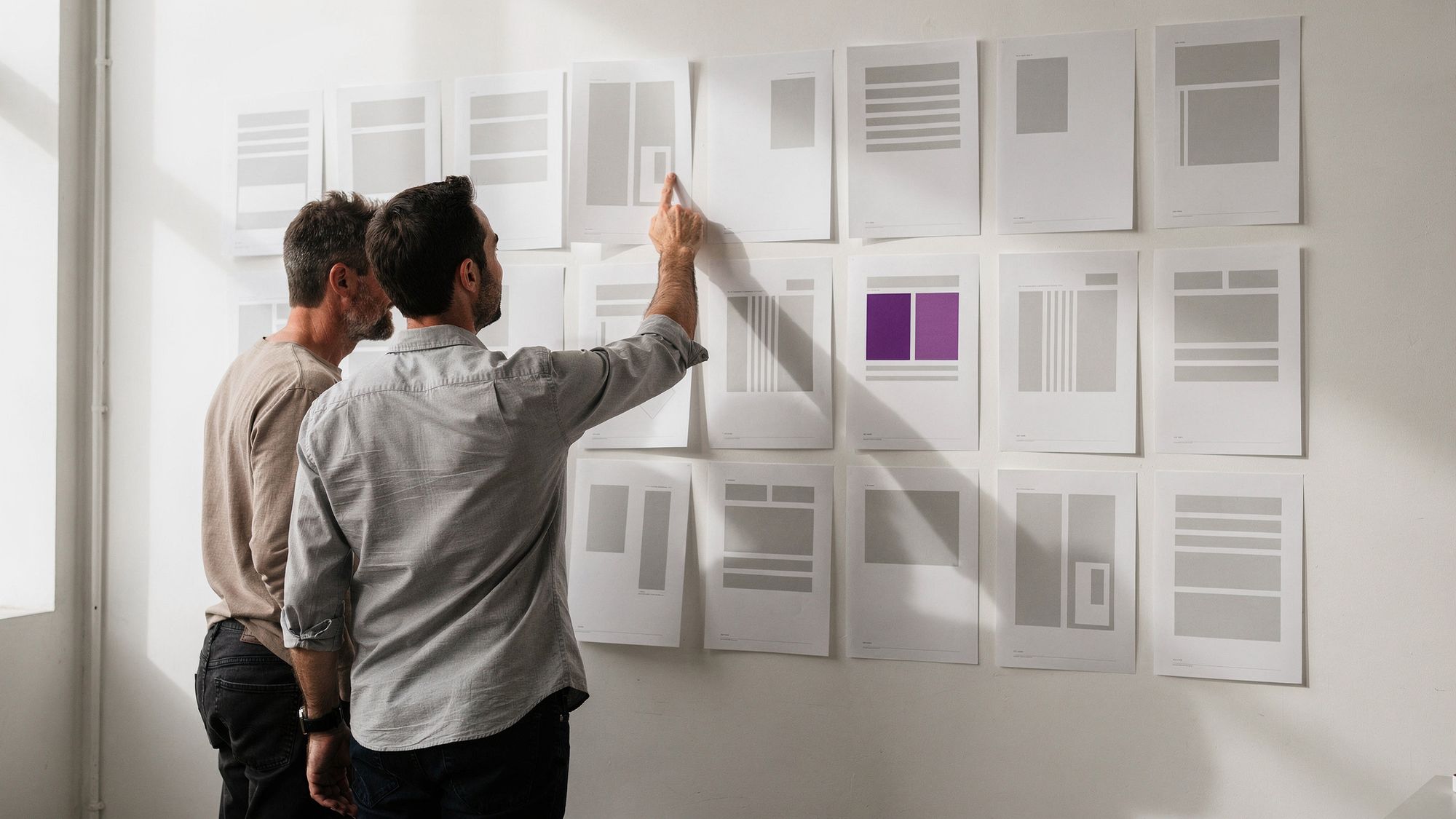
Every layout that feels right is following rules, whether or not the person who made it could name them. Every layout that feels wrong is breaking one.
This article covers the ten design principles I work from, what each one does, and how to use them as a checklist on your own work. There is also a section at the end answering the question everyone asks first, which is why the lists you find online never agree on the number.
What Are Design Principles?
Design principles are the guidelines a designer applies, usually without announcing them, to make a composition work. They are the rules behind a visually appealing design that also makes sense to the person looking at it.
They represent accumulated work from researchers and practitioners across design, behavioral science, sociology, physics and ergonomics. Design fundamentals are borrowed knowledge more than invented rules.
Although we discuss them separately, in practice they work together. You apply them while selecting, creating and organizing what goes on the page. Experienced designers know how these reinforce or contradict each other, and that is what lets them predict how a viewer will react before anyone sees the work.
It is worth separating two terms that get used interchangeably. The elements of design are the raw material: line, shape, color, texture, space, form, value. The principles are what you do with them. Elements and principles are a vocabulary and a grammar, in that order. Art and design both run on the same pair.
Which Design Principles Matter?
Search for the term and you will find lists of five, seven, ten, twelve and seventeen. The number is not the point. Most lists cover the same ground with different groupings.
After more than 20 years and thousands of designs, I work from ten rules that I consider the most important on any project.
Why ten and not the twelve that most lists mention? Because two of them, proportion and empty space, are results of applying the others rather than separate rules. That is not a demotion. I just treat them as part of balance and proximity.
Here are the ten core design principles I use, in no order, because they carry equal weight:
1. Balance

Objects in real life have physical weight. Visual elements have visual weight. Large elements read as heavy, small ones as light, and each carries weight in proportion to the attention it attracts.
Balance is the distribution of that weight across objects, colors, texture and space, including negative space. Visual balance means the design carries roughly equal weight on both sides of its center. Get it right and the composition feels settled instead of chaotic.
It's like a scale: too much weight on one side, and everything gets unbalanced.
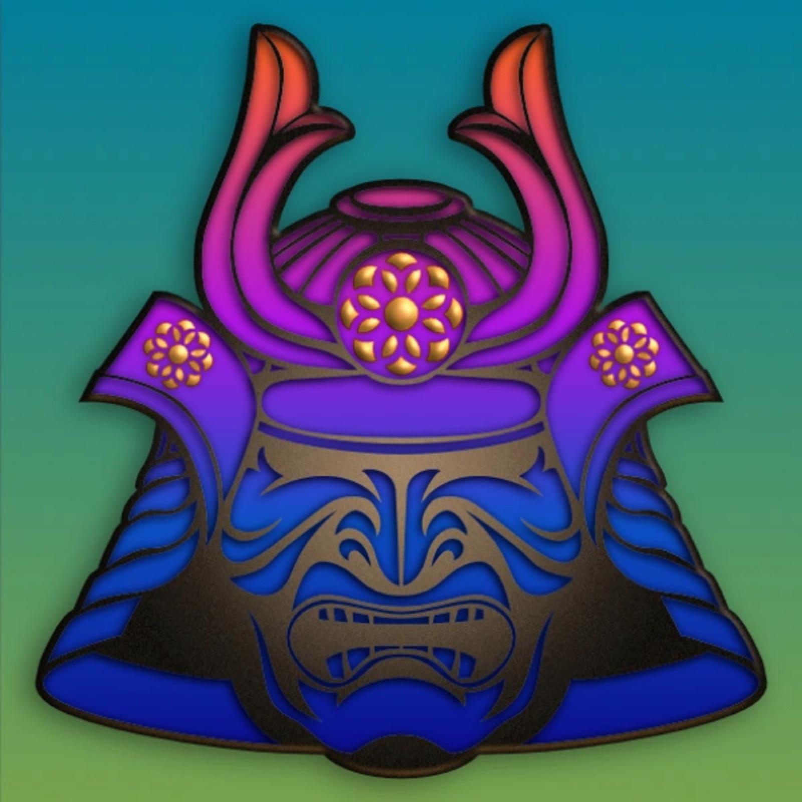
Symmetrical Balance
A symmetrical design uses an imaginary line to divide a work into two halves around a central point. Elements of equal visual weight sit on each side of the axis, which is what creates the symmetry.
There are two variants: reflective symmetry, where the two halves are exact mirror images, and translational symmetry, where the same shape appears on both sides of the design.

Asymmetric Balance
An asymmetrical composition uses uneven elements. One side may hold a visually heavy element, balanced by several lighter ones opposite. Asymmetrical balance still balances, and it produces a different experience. Where a mirrored layout can read as static and predictable, asymmetry feels more dynamic.

Radial Balance
This is when elements radiate from a point at the center of a design. Think of the rays shining from the sun or the petals of a rose. This form of symmetry is a way to add depth and movement to a design, drawing attention to an object in the center of a composition.
2. Contrast
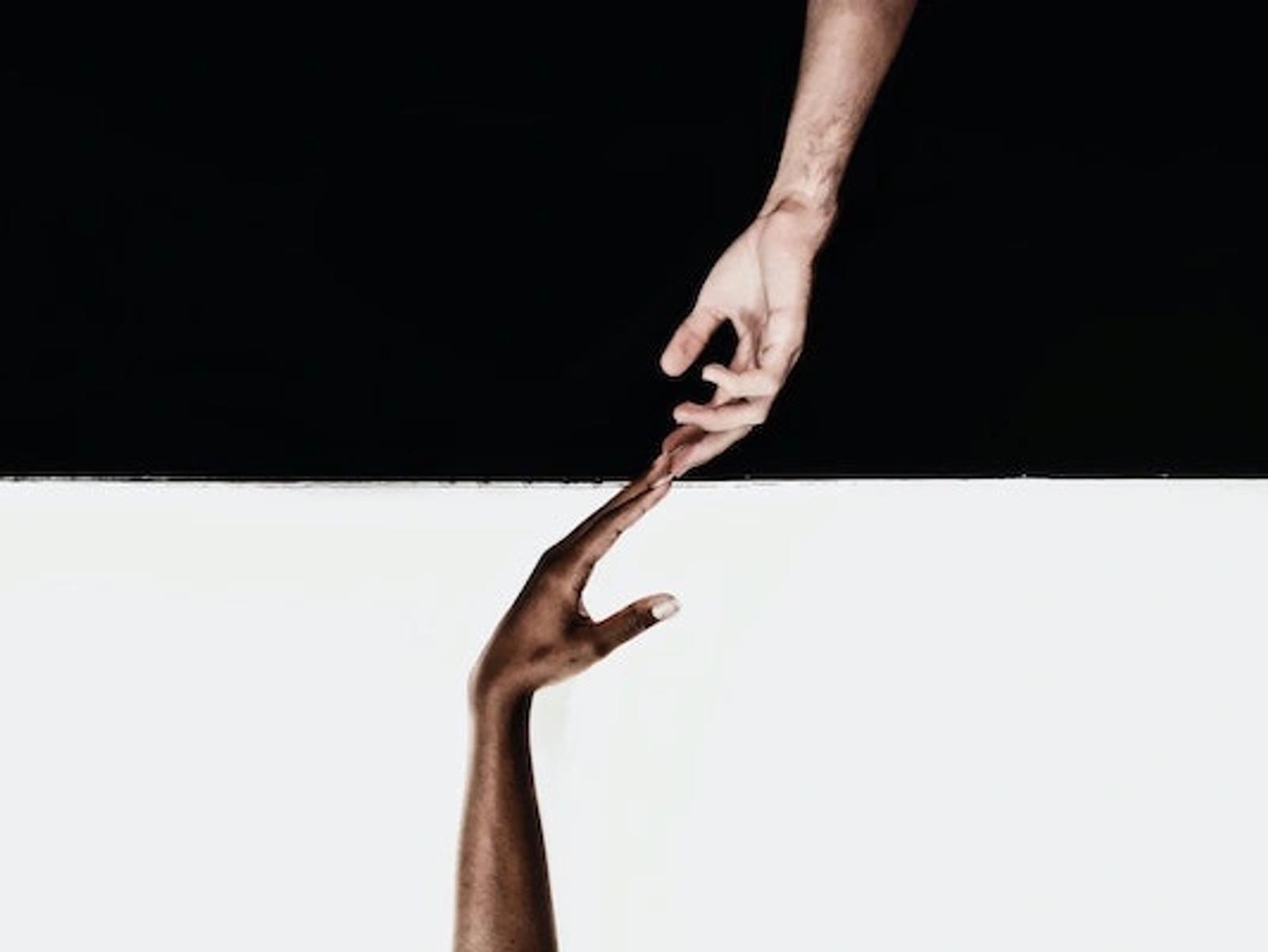
Contrast is the opposite of similarity, and people respond to difference. A design where everything looks alike gives the eye nowhere to go. By varying color, shape, size, texture and type, you can draw attention, control the visual flow and keep someone engaged.
Contrast occurs when two or more elements of a composition are different. It can create specific effects, emphasize the importance of certain features, and add visual appeal to your designs. As with most of the elements of art, the job is to strike a balance. Color, typeface and size all work. Too many variations at once confuse the viewer, which is the opposite of the intended effect. Color theory does a lot of the heavy lifting here, and we cover it in color psychology in web design.
3. Emphasis
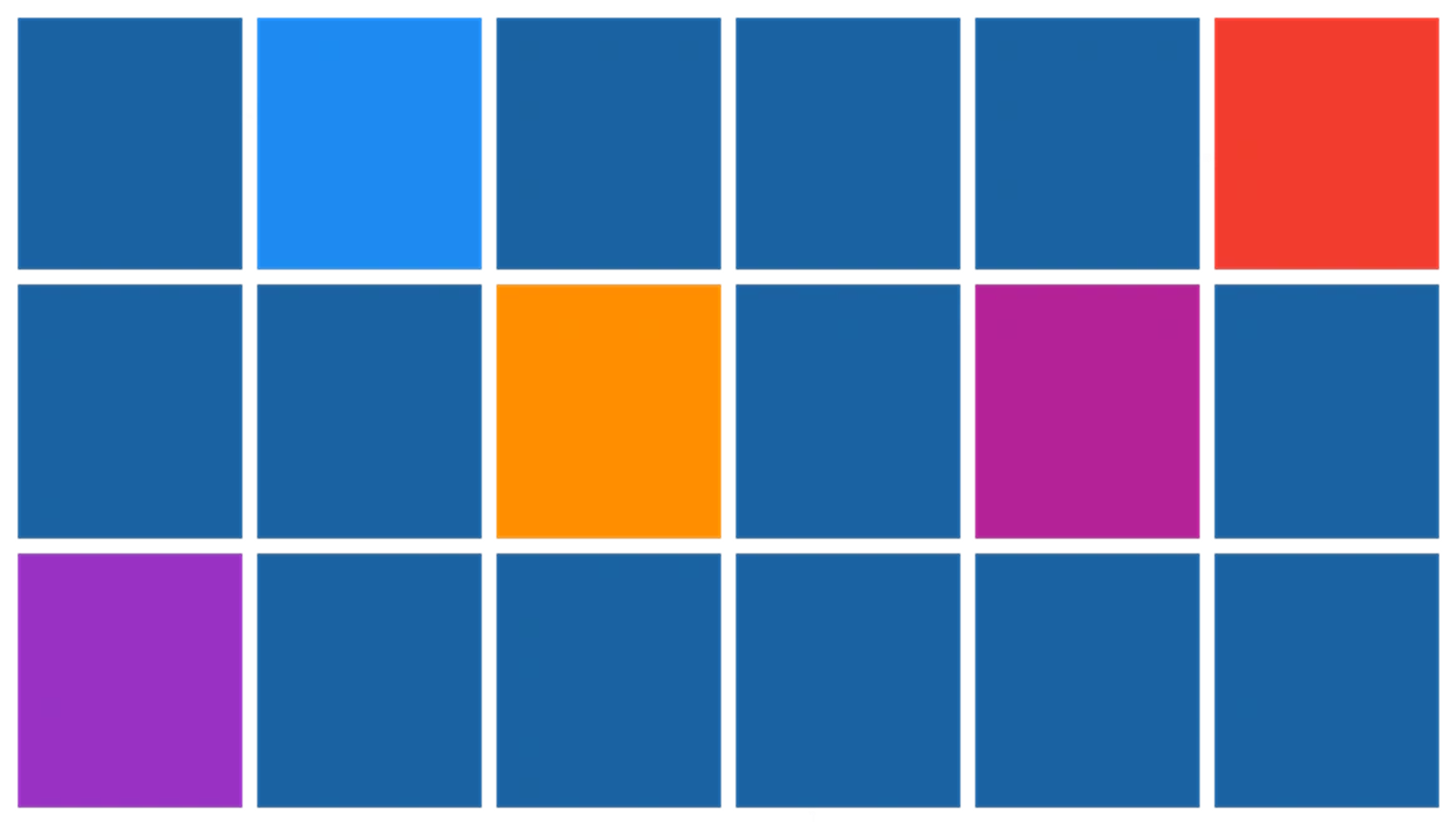
Emphasis draws the viewer's attention to one design element: a content area, an image, a link, a button.
This one is closely related to the next, hierarchy, since the objective of emphasis is to create a focal point in the design composition. This effect is achieved by manipulating elements such as color, shape, and size to make specific parts of a design stand out. We see emphasis used in most fields of design, including architecture, landscape design, and fashion design.
Say you want to draw attention to a call to action on a web page. Increase the size of the text and use a color that stands out from the background, and the button stops being something visitors can miss. Our guide to call to action buttons goes through this in detail.
4. Hierarchy
Information ranked from most important to least important is easier to navigate and absorb. Visual hierarchy rests on a well-documented tendency: the brain organizes what it sees into a coherent whole rather than reading each part in isolation.
Hierarchy organizes the value of a design's parts by drawing the eye to the most important thing first.
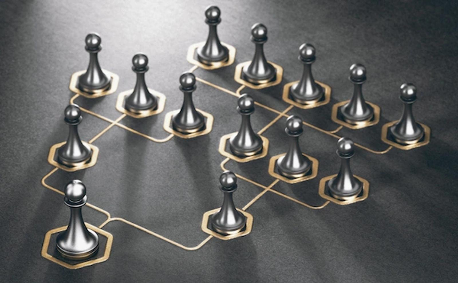
In design, the hierarchy is used to: Add structure, Create visual organization, Create direction, Add emphasis.
Several visual tricks help to plot the correct flow path:
- Size and scale. The larger an item is, the more likely a viewer will see it. Doing something smaller can reduce its importance and put the emphasis elsewhere.
- Color and contrast. Use bright colors to make certain elements stand out. A splash of color makes a large difference.
- Type. Use different fonts and styles such as italic and bold to draw the eye and move text higher or lower in the hierarchy. Choosing those fonts well is its own discipline, covered in how to choose a font for your website.
- White space. Empty area around an element gives it breathing room and makes it stand out.
Establishing a clear visual hierarchy is important because it holds a design together. If used effectively, hierarchy can make a complex message simple.
5. Proximity
Proximity indicates that elements are connected or have a relationship with each other and become an optical unit that helps organize or give structure to a design. Proximity ensures that related design elements are placed together. Any unrelated parts must be separated.
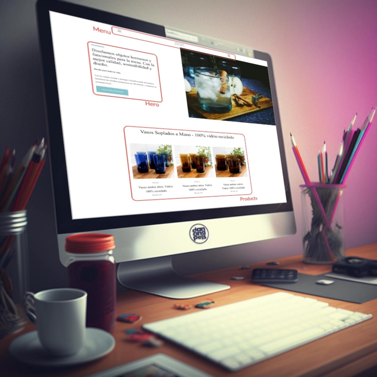
Empty area is good. Group related items together and use large open regions to add organization and structure to the design.
Varying the amount of open area to join or separate elements is how you communicate meaningful groupings. This article is an example. Each section is separated from the next by a larger gap than the one between paragraphs inside it.
The same effect appears in plain text: sentences group into paragraphs, separated above and below by empty lines.
A typical beginner mistake is scattering elements across the page to fill the gaps. This often results in poor proximity, as related components need to be grouped together, making it easier for the viewer to determine the relationships and connections of the information. Feel free to group related items and use large space areas to add organization and structure to the design.
6. Alignment
Alignment is the most straightforward of the ten. It is the arrangement of elements on a page so they stop reading as a mess. Aligning elements creates a visual connection between them and brings order to the design. Without it, the placement of elements reads as directionless. It is worth applying constantly rather than occasionally.
Alignment is the placement of items so they line up in a composition. In design, we use alignment to organize elements, to create structure, and next to proximity, to create connections between elements, obtaining a clear result. Usually alignment follows an invisible line, though it can also be implied by a real edge. Either way, it is a tool for achieving a particular look.
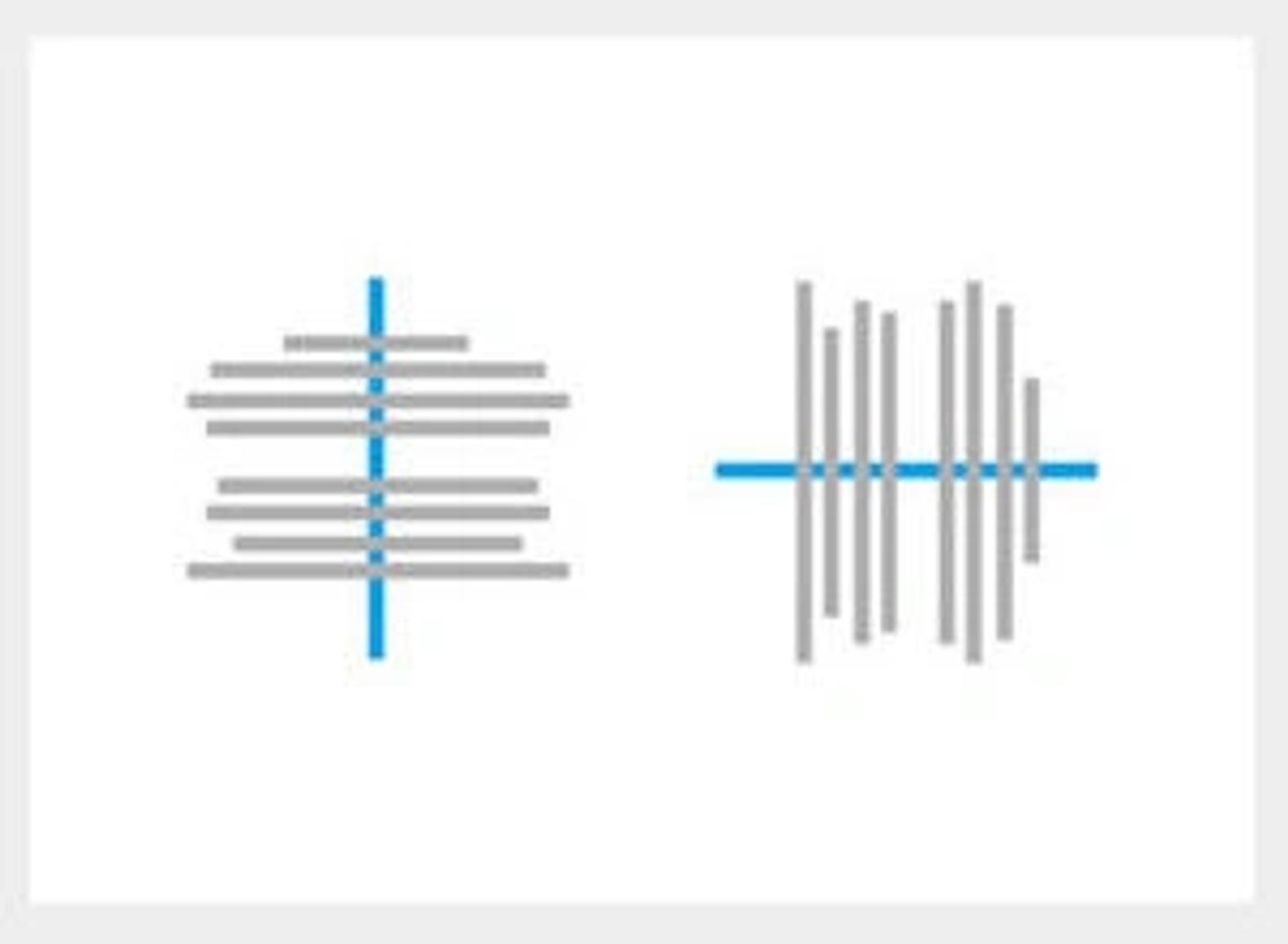
There are two kinds of alignment: edge alignment and center alignment.
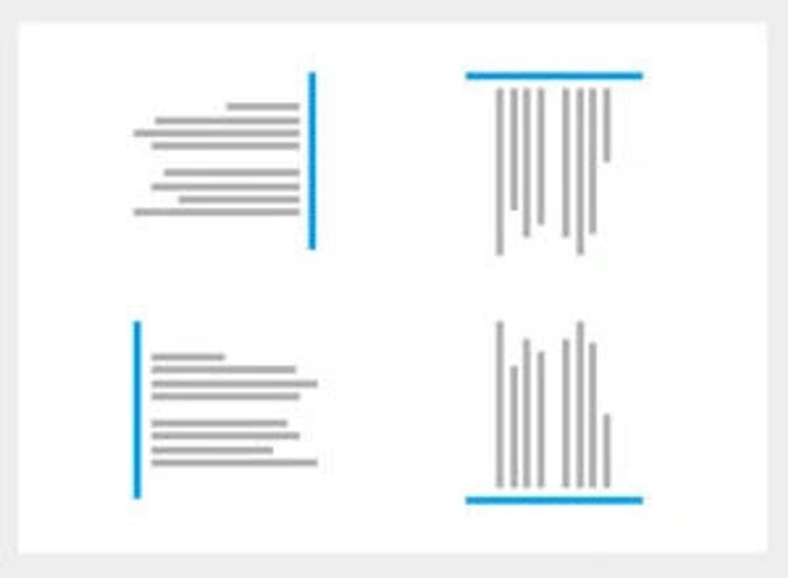
Border alignment
As the name suggests, border alignment refers to content placement on any page or canvas edges. Everything stays on the edge whether the elements are placed on the page's right, left, top, or bottom. It is called horizontal alignment if the border alignment arranges the elements to the left or right. Still, if the elements are placed on the top or bottom edge, it is called vertical alignment.
Center alignment
This second type of alignment places the content on the imaginary center line. Let's take an example of center-aligned text. Each line may have a different width, but each sits in the center of the page. The same rule applies to every element in the design. The funny thing is, if the imaginary central line runs from top to bottom, we get the horizontal alignment. Similarly, our content is aligned vertically if the center line runs along the horizontal plane from side to side.
7. Repetition

As you may have already guessed, repetition refers to when an element is repeated throughout a design. It could be a particular font color, or a repeating pattern added to a social media post, and to the next social media post, and to the one after that. See what I did there?
Repetition makes the designs visually exciting and cohesive. It also creates a sense of consistency by using a repetitive motif that the viewer comes to expect. Repeating elements are what make a brand identity distinctive.
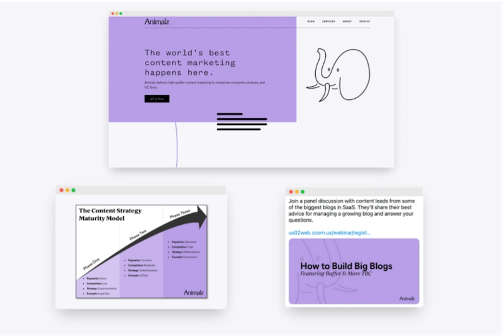
Brand identity is the visible part of your brand. It separates your company from every other one, so people recognize your work on sight. Every successful business uses repetition. Why do we equate a blue can with Pepsi? Because the image was repeated until it became the brand.
Repetition will make you a decent phone wallpaper. It will also build a visual identity and brand recognition, which is the more valuable outcome.
8. Rhythm
Rhythm in design is a relationship between elements that produces a sense of harmony. You can leave the dancing shoes at home.
It gives a composition a sense of movement and action. Rather than letting the eye settle on one focal point, rhythm encourages the viewer to move through the whole piece, following the shapes. Nature and fine art are full of it.
There are three different types of rhythm:
- Regular rhythm: the elements are repeated precisely in an evenly spaced arrangement.
- Fluid rhythm: movement is suggested through the repetition of organic forms or the irregular repetition of repeated elements.
- Progressive rhythm: a sequence is created in which the elements are slightly changed each time they are repeated.
Notice how these are joining up. Get emphasis and hierarchy right and rhythm follows almost by itself. Worth repeating:
Instead of letting the viewer's eye settle to a focal point, the rhythm encourages viewers to move their eyes through the entire piece, following the shapes naturally.
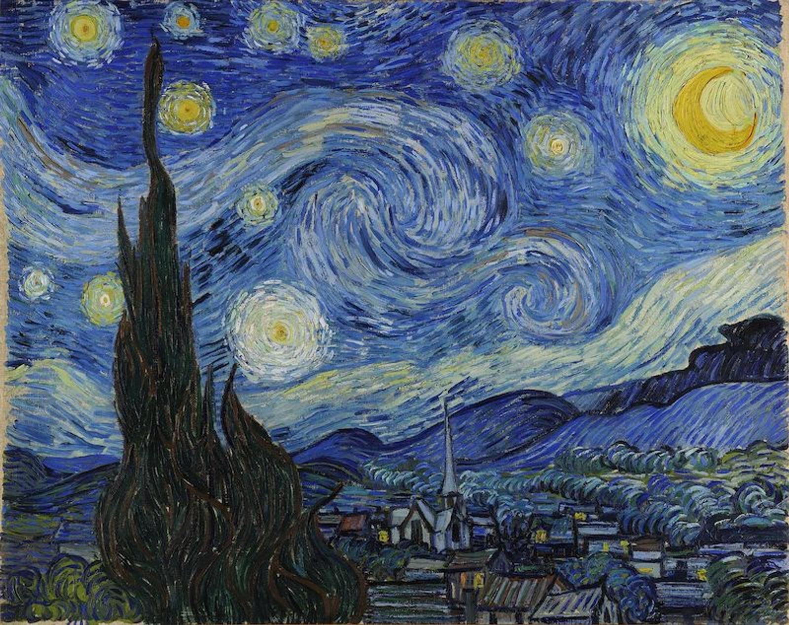
One of my favorite examples of rhythm is "The Starry Night" by Vincent van Gogh. The brush strokes carry an unstable, dynamic movement across the whole canvas. This article will not turn you into van Gogh. It should show you how rhythm sets a tone, creates a feeling, and turns looking at a design into an active experience.
9. Movement
Movement in design is about how the eye travels, not about anything actually moving. It creates a sense of direction within a composition and guides the viewer's eye from one element to the next.
A good designer can guide the viewer by using lines, borders, shapes, and colors to create focal points and make objects look a certain way.
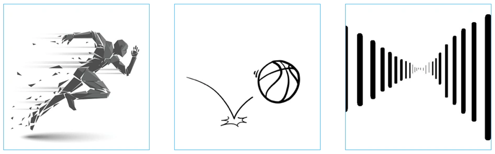
The visual journey can control the progression of the viewer's eyes in and around the composition. For example, the eye will travel along a real path, such as a solid or dotted line. It also follows subtler paths: from large elements to small ones, from dark to light, from unusual shapes to familiar ones.
Keep it simple. Using more than one movement technique in a single composition tends to confuse people.
10. Unity
It is no coincidence that unity is last. It only happens when everything else coexists to form a whole that is pleasing to look at.
Unity can be interpreted in two ways:
- Conceptual Unity. The act of combining things for the convenience of the user. It is best achieved by thinking about content and function. On a website, if the content or function of one page can be merged with another, you reduce the number of steps between a user and their goal. On an event poster, it means every piece of information about the event is actually on the poster. Imagine leaving off the date. Conceptual unity means related actions are grouped in a way that anticipates what someone needs next.
- Visual Unity. Best described as harmony: how the different elements of a piece come together into a sense of wholeness. Within a design, this is what separates a system from a collection.
Visual unity adds order and makes a piece feel like a coherent whole rather than a messy combination of individual parts that exist on the same page.

To achieve unity, you need to keep three things in mind: whether the elements you've used have a good reason to be there, whether they work together, and whether the message or concept you're trying to display is clearly communicated.
Putting the Principles to Work
These ten apply whether you are designing a logo, a poster or a website. Learning them is quick. Applying them under deadline is the part that takes practice.
They do not work in isolation. Combining them coherently is what produces the result, and they help most when you can name which one a layout is missing. Design trends keep moving, so keep looking at what other people are making and asking what technique is doing the work. Graphic design rules age; these ten do not.
Now all that is left is to get to work.
Questions About Design Principles
What are the 7 principles of design?
The most common short list is balance, contrast, emphasis, movement, pattern, rhythm and unity. It covers most of what a beginner needs. My ten add hierarchy, proximity and alignment, which matter more in interface and layout work than in fine art.
What are the 12 principles of design?
That longer list usually adds proportion, variety, harmony and a few others to the seven above, depending on the source. As explained earlier, I treat proportion and white space as outcomes of balance and proximity rather than as separate basic principles.
What are the 5 basic design principles?
When a list is cut to five, it is almost always balance, contrast, hierarchy, alignment and repetition. That set will carry a graphic design project a long way on its own, and the principles of graphic design rarely need more.
What are the 17 key principles of design?
Longer lists split the same ideas into finer categories, adding items such as scale, dominance, tension, depth and typography. Anyone comparing lists will find that the extra entries are mostly subdivisions rather than new concepts. Beyond about a dozen, a list stops being a working tool and becomes a principles of design infographic.
What is the difference between elements and principles of design?
Elements are the things themselves: line, shape, color, texture, space, form and value. Principles are the rules for arranging them. You cannot apply one without elements, and elements with no rules produce a mess.
Why are design principles important?
They turn taste into something you can discuss. When a layout feels wrong, naming the missing rule tells you what to change. Good design is rarely the result of inspiration alone; it is usually the result of knowing which rule the composition is breaking.
How can design principles be applied in practice?
Use them as a review checklist rather than a recipe. Once a layout exists, walk through the ten in order and ask whether each one is doing any work. Design principles help most at this stage, including on a minimalistic design where there is less to hide behind. Great design usually comes from that second pass, not the first.
What are the gestalt principles?
They describe how people perceive grouped visual information: proximity, similarity, closure, continuity and figure-ground. They sit underneath several of the ten here, particularly proximity and unity, and explain why those work rather than just asserting that they do.
Where the Principles Become a Business Asset
Applied once, they make a poster better. Applied consistently, they become a design system: a set of decisions that every future page inherits, so the tenth page of a website costs less to make than the second and still looks like it belongs.
That is what we build at Dancing Pels through Custom Websites, where the visual system is part of the deliverable rather than an accident of the first three screens. Keeping that system consistent everywhere afterwards is the subject of brand consistency.
If you are looking at your own site and can name what is wrong but not why, book a discovery call and we will go through it together.