
What Is Responsive Web Design and Why Does It Matter?
Julio Arango · 12 min read · Updated August 2026

Responsive web design is an approach to web design that makes one website adapt its layout to whatever screen it is opened on. One set of HTML and CSS, one URL, one site to maintain, and a design that adapts from a mobile phone to a desktop computer without anyone building a second version.
The term comes from Ethan Marcotte, who named it in 2010 and described three ingredients: fluid grids, flexible images and CSS media queries. Fifteen years later those are still the core components, though modern CSS has made all three considerably easier.
This guide covers the responsive web design basics: what it is, how it works, how it differs from adaptive design, the benefits of responsive web layouts for business and SEO, and how to test whether your own website is responsive.
What Is Responsive Web Design?

Responsive web design is a web design approach in which the layout responds to the size of the browser window. Content reflows, columns stack, images resize and navigation changes shape, all from the same code. The purpose is to make web pages render well on any screen without building a second site.
The alternative used to be a separate mobile site on its own subdomain, with its own content and its own maintenance burden. Responsive web design became the standard because keeping two sites in sync is a job nobody enjoys and everyone eventually stops doing.
The key idea is that you stop designing for devices and start designing for ranges. There is no "tablet layout" so much as a set of rules about what happens as available width changes. That is why a responsive site still works on a screen size that did not exist when it was built, and why responsive web design ensures a site ages better than a fixed one.
How Responsive Web Design Works
Four mechanisms do the work. You do not need to write them yourself, and knowing the principles of responsive layout makes it much easier to talk to the web developers who do.
Fluid grids
Instead of fixing a column at 960 pixels, a fluid grid defines it as a percentage of the available space. Using fluid grids means the layout scales continuously rather than jumping. A responsive grid built this way needs no fixed sizes: relative units such as percentages, rem and viewport units replace pixel values, so everything stays in proportion as the browser width changes.
Flexible images
Responsive images are constrained to their container rather than their own dimensions, usually with a maximum width of 100 percent. Modern markup goes further and serves a different image file depending on screen width, so a phone never downloads a photo sized for a desktop computer.
CSS media queries
Media queries are the conditional rules in your stylesheet: when the viewport width is above or below a certain value, apply this set of styles instead. This is where breakpoints live. A breakpoint is simply the viewport width at which the layout changes, and good breakpoints are chosen by where the design stops working rather than by device names.
The viewport meta tag
Using HTML, a single line tells a mobile browser to render the page at the device width rather than pretending to be a desktop and zooming out. Without it, everything else fails. It is the single most common reason a site that was built responsively still looks wrong on a phone.
Modern CSS layout
Flexbox and CSS Grid changed how responsive layout is built. A modern CSS layout can reflow without any media queries at all in many cases, using rules that let items wrap and resize on their own. A flexible grid of this kind means fewer breakpoints and fewer places for the design to break, which is why building responsive pages is now easier than it has ever been.
Responsive vs Adaptive Web Design
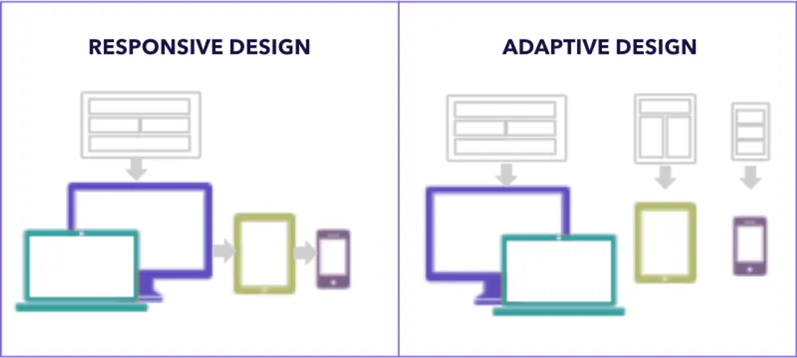
These two get confused constantly.
Responsive design is fluid. One layout flexes continuously across every screen width. Resize the browser window slowly and you watch it rearrange.
Adaptive design is stepped. The site detects the device or width and serves one of several fixed layouts, typically three to six. Resize the browser and nothing happens until you cross a threshold, then the layout snaps.
Responsive is the default for almost everything today, because it handles screen sizes and devices that did not exist when the site was built, and because one design adapts across different devices without extra work. Adaptive still appears where a business needs tight control of a specific experience, or where a legacy system makes a full rebuild impractical.
There is a related distinction worth knowing. Mobile-first design is not an alternative to responsive design; it is the order you work in. A mobile-first design approach builds the smallest layout first and expands upward, and responsive design is how that gets implemented.
Why Responsive Web Design Matters
Most of your visitors are on a phone. For many businesses mobile devices account for well over half of all traffic, and often much more. A site that is awkward on smaller screens is awkward for the majority, so a mobile-friendly design is no longer optional.
Google indexes the mobile version. Search engines predominantly crawl the mobile rendering of your pages. Content that only exists on the desktop version effectively does not exist for search.
One site is cheaper. Whichever type of website you are building, development costs multiply when there are two codebases. One responsive website means one place to publish, one place to fix, one analytics view, and web designers who only have to maintain a single system.
It future-proofs the layout. New screen widths arrive constantly. A design that adapts by rule rather than by device keeps working across all devices without a rebuild, because it can adapt to different screen sizes it was never tested against.
It affects conversion. Text people can read, buttons people can tap and pages that load quickly all improve the user experience and move numbers, and none of them happen by accident on a small screen.
Examples of Responsive Design

Responsive website design examples are easiest to see when you know what to look for. Each one shows how a single design adapts rather than switches.
The stacking grid. A three-column layout on desktop becomes two on a tablet and one on a phone. The order in which those columns stack is a deliberate decision, since it becomes the reading order for most of your audience.
The changing navigation. A full horizontal menu on wide screens collapses into a compact control on narrow ones. Done well, the same links are present in both.
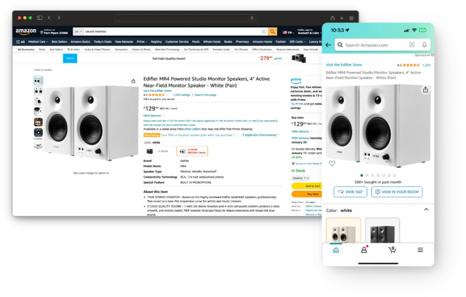
The product page. Image gallery beside the details on desktop, image above details on a phone, with the buy action always in reach. Large retailers get this right because they measure it.
Responsive text. Font size, line length and spacing all change with the viewport. Line length is the one most often forgotten, and it is the one that decides whether long copy is readable.
The reflowing table. Data that sits in columns on a desktop computer becomes stacked cards on a phone, because horizontal scrolling on a table is a small tragedy. This is one of the best tests of whether a build was thought through.
Best Practices for Responsive Web Design
- Start from the smallest screen. Mobile design first, then expand. Building small and expanding produces better results than shrinking and hiding.
- Set breakpoints from the content. Drag the browser slowly and add a breakpoint where the layout starts to look wrong, rather than at named device widths. Best practices here come from your own content, not from a list of devices.
- Use relative units. Percentages, rem and viewport units let a design scale. Fixed pixel values are what break at unexpected screen widths.
- Serve responsive images. Different files for different screen widths is the single biggest performance win on most sites, and the best return for the least effort.
- Keep tap targets large. Around 44 pixels, with space between them.
- Test real text. Long names, long headlines and long words break responsive layouts far more often than the design does.
- Optimize performance. A responsive site that loads a desktop-weight page on a phone has solved the layout and not the experience.
- Check accessibility at every width. Contrast, focus states and reading order all need to survive the reflow. Testing responsiveness and testing accessibility are the same pass done twice.
How to Test If a Website Is Responsive
- Resize the browser window slowly. Drag it from wide to narrow and watch. Anything that overlaps, overflows or disappears is a bug.
- Use your browser's device tools. Every modern browser can simulate common screen sizes and slow connections.
- Open it on real devices. An actual phone reveals touch and speed problems that no simulator will.
- Zoom to 200 percent. Accessibility guidelines expect content to remain usable, and this catches fixed-height containers.
- Run a speed test on mobile. Core Web Vitals are measured on mobile hardware.
- Check the viewport meta tag. If it is missing, nothing else in the list matters. This single check will tell you whether anyone tried to create responsive behavior at all.
Is Responsive Web Design Difficult to Implement?
On a new site, no. Almost all the people who build websites today start from a framework or theme that is responsive by default, so the best practices are the defaults, and modern CSS makes flexible layout the path of least resistance rather than an extra effort.
Retrofitting an old site is a different question. A fixed-width layout built on absolute positioning and pixel values usually costs more to convert than to rebuild, and the rebuild leaves you with something maintainable rather than patched.
The genuinely hard parts are rarely technical. They are editorial: deciding what to show first on a small screen, which sections earn their place, and what the priority order actually is. That work is the same work described in our guide to aesthetics and functionality.
Questions About Responsive Web Design
What is responsive web design?
It is an approach to web design that makes web pages render well on a variety of devices by using fluid grids, flexible images and CSS media queries. Responsive web pages adapt their layout to the screen they are viewed on, from one codebase.
What are examples of responsive design?
A three-column desktop layout that stacks into one column on a phone, a menu that collapses on narrow screens, a product page that reorders its image and details, and text whose size and line length change with the viewport width.
What is responsive vs adaptive web design?
Responsive design flexes continuously across every width. Adaptive design serves one of several fixed layouts based on the detected device or screen width. Responsive handles the unknown better; adaptive gives tighter control over a small number of known cases.
Is responsive web design hard?
Not on a new build, where it is the default. Converting an old fixed-width site is harder, and the difficulty is usually in the content decisions rather than the code.
Is responsive web design still a thing?
It is so standard that the term has almost disappeared from briefs, which is what happens to any technique that wins. The work now is in performance and in the quality of the experience on smaller screens rather than in whether the site adapts at all.
How does responsive web design work?
The viewport meta tag tells the browser to use the real device width. A fluid grid sizes elements in relative units. Media queries apply different rules at different widths. Flexible images stay inside their containers. Together they let one set of HTML and CSS produce a sensible layout at any size.
What are the core components of responsive web design?
Fluid grids, flexible or responsive images, CSS media queries, the viewport meta tag, and increasingly Flexbox and CSS Grid, which handle much of what media queries used to do. Together they are what make a website work at any size.
Where This Sits in a Real Project
Responsive behavior is not a feature to ask for. Any competent web design and development team builds it in, and the questions worth asking are about what happens at each width and why.
That is how we build Custom Websites at Dancing Pels: one site that adapts across devices, designed from the smallest screen up, with the reading order on a phone treated as a decision rather than a consequence. The reasoning behind that order is covered in our guide to design principles.
To ensure your website is genuinely responsive rather than merely shrinking, book a discovery call and we will look at it on a few real screens.