
Mobile-First Design: What It Is and Why It Still Matters.
Julio Arango · 13 min read · Updated August 2026

Most people who visit your website are holding a phone. That has been true for years, and yet a large share of business sites are still designed on a wide monitor and squeezed down afterwards. The result is a phone version that technically works and quietly loses people.
Mobile-first design flips the traditional order. You design for the smallest screen first, then expand your design as space allows. This guide to mobile-first design covers what the approach is, how it differs from responsive design, the mobile-first design principles behind it, its effect on SEO, and how to run design and development without doubling your workload.
What Is Mobile-First Design?
A mobile-first design approach starts the design process with the smallest screen and works upward. You decide what a mobile user needs, build that first and then add for larger screens, rather than designing for larger screens and removing things on the way down. Designing for small screens first is the whole idea in one sentence.
The idea comes from progressive enhancement. Start with the essential experience, then layer on what bigger screens and faster mobile networks allow. The order matters because it changes what gets cut. Designing on desktop means deciding late what to remove; starting from mobile constraints means deciding early what actually matters.
That constraint is the real value. A mobile screen has no room for a decorative hero, a five-item value proposition and three competing calls to action. It forces content first thinking, and most of those decisions turn out to improve the desktop layout too. A mobile-first mindset is mostly a subtraction habit, and mobile-first design works precisely because subtraction is hard to do voluntarily on a large canvas.
How It Differs From Responsive Design
These get used interchangeably and describe different things.
Responsive design is the technical capability: one site whose layout adapts to different screen sizes using flexible grids and media queries. It says nothing about where you started.
Mobile-first design is a design strategy and a sequence: begin your design process with the smallest screen. Mobile-first is a design strategy, and responsive web design is how it gets built, so the two are not alternatives.
You can build a responsive site desktop-first, and plenty of teams do. It usually produces a mobile version of your site that is the desktop layout with things hidden, which is why so many phone experiences feel like a compromise. Mobile-first and responsive design work together: one is the mindset, the other is the implementation. Designing for mobile first ensures the mobile layout is a decision rather than a leftover, and mobile-first design ensures nothing important gets hidden on the way.
Why It Matters

Mobile devices account for most web traffic. For a local or consumer-facing business, mobile traffic often passes 70 percent. Even in business-to-business, the opening visit is frequently a check on a mobile device between meetings.
Google uses mobile-first indexing. It predominantly crawls and indexes the mobile version of your site. If content or structured data exists only on desktop, it effectively does not exist for search.
Mobile users are often in worse conditions. Weaker connections, smaller targets, one thumb, daylight on the screen, and something else competing for attention. Speed is critical on mobile in a way it never is on a desk, and a mobile-first approach helps because it treats those constraints as the starting point rather than an edge case.
Constraints improve decisions. The hardest question in web design is what to leave out. When you design for mobile, the screen answers it for you.
Is Mobile-First Design Still Relevant?
Yes, though the argument has changed. Ten years ago it was a competitive advantage, because most sites were bad on phones and fixing yours produced dramatic numbers. Today a decent mobile experience is the baseline, and the advantage has moved to the details: how quickly on mobile the page becomes usable, how few steps a booking takes, whether forms work with one hand. Mobile use has also changed shape, moving from browsing to acting.
The other thing that changed is where it matters. Email, ads and search results are all consumed on the same device, so the whole path from opening impression to inquiry runs through the mobile web on a single screen.
So the answer is yes, but treat it as hygiene rather than as a project. The businesses winning here now are winning on speed and clarity, not on simply having a mobile-first website at all.
Mobile-First Design Principles
- Content first. Decide what has to be on the page before deciding how it looks. Everything else follows from that list.
- Design for touch. Tap targets of at least 44 pixels, spaced so a thumb cannot hit two at once, and important actions within reach of the bottom of the screen.
- One column, clear order. Mobile-first layouts are vertical. The order you choose is the order everyone reads, so it has to be the priority order.
- Performance is a design decision. Every image, font and script is a cost paid on a mobile network. Design within a budget rather than optimizing afterwards.
- Progressive enhancement. Build for the smallest device first and progressively enhance from there. Working through screen sizes first and layout second keeps priorities straight. Extra columns, hover states and richer imagery are additions, not the baseline, so you design for larger screens last and that keeps them honest.
- Test on real devices. A resized browser window lies about touch, about connection speed and about how the page feels in sunlight.
The Benefits of Mobile-First Design
- A better user experience on mobile, because good mobile design ensures the small screen was designed rather than derived.
- Faster pages, since starting lean makes it harder to accumulate weight. Mobile performance is the constraint that keeps everything else honest.
- Better SEO, because the version Google indexes is the version you designed with the most care.
- Higher conversion, mostly through fewer steps and clearer actions rather than through any single trick. A better mobile user experience shows up in bookings before it shows up anywhere else.
- A simpler desktop site. Teams that start small usually ship a cleaner large-screen layout, because the content was already reduced to what matters.
- Lower cost over time. One well-structured site for mobile and desktop is cheaper to maintain than a desktop version plus a separate mobile app to keep in sync.
How Mobile-First Design Affects SEO
Mobile-first indexing means Google evaluates the mobile version of the page. Three practical consequences follow.
Content parity matters. Anything hidden on the mobile interface that exists on desktop is at risk of being ignored. Collapsible sections are fine, since the content is in the markup; content that is genuinely removed is not.
Speed counts. Core Web Vitals are measured on mobile hardware and slow networks, well below the machine your designer works on.
Usability signals count. Tap targets that are too close together, text that requires zooming and content that shifts while loading all get flagged, and all of them are design decisions rather than technical ones.
The Mobile-First Design Process
The mobile-first design process has five steps, and it is the same whether you are starting fresh or fixing an existing site.
- List the content. Starting the design process here rather than in a design tool is what makes the rest work. For each page, what does a visitor need and in what order? Write it as a list.
- Sketch the mobile layout first. One column, real content, no placeholder text. This is where most of the hard decisions get made, so stay on the mobile interface until it is settled.
- Set a performance budget. Decide the maximum page weight and load target now, so image and font choices have a constraint to meet.
- Scale your design upward. Take the mobile layout to tablet and desktop, adding space and hierarchy rather than adding new content. This is where a responsive design adapts layouts rather than replacing them. If a section only exists on desktop, ask why it exists at all.
- Build and test on devices. Real phones, real networks, and someone who has not seen the site before.
Best Practices Worth Applying
- Keep navigation to a handful of items with plain labels. Good mobile UX starts with fewer choices, not smaller ones.
- Put the primary action where a thumb can reach it, and repeat it down long pages. Our guide to call to action buttons covers the rest.
- Set body text at 16 pixels or larger, since anything smaller invites zooming.
- Compress images, serve modern formats, and lazy-load anything below the fold. Page weight is crucial for mobile users on a slow connection.
- Reduce form fields to what you genuinely need. Every field costs completions, and it costs more on a phone.
- Avoid interactions that depend on hover, since there is no hover on a touchscreen.
- Check contrast, because a phone gets used outdoors. This is where color psychology in web design meets accessibility.
- Test the booking or inquiry flow on a phone monthly. It is the path that matters most and the one nobody rechecks.
What the Early Results Showed
The most-quoted numbers in this field come from the years when large retailers rebuilt for the small screen, and they are worth reading in that context.
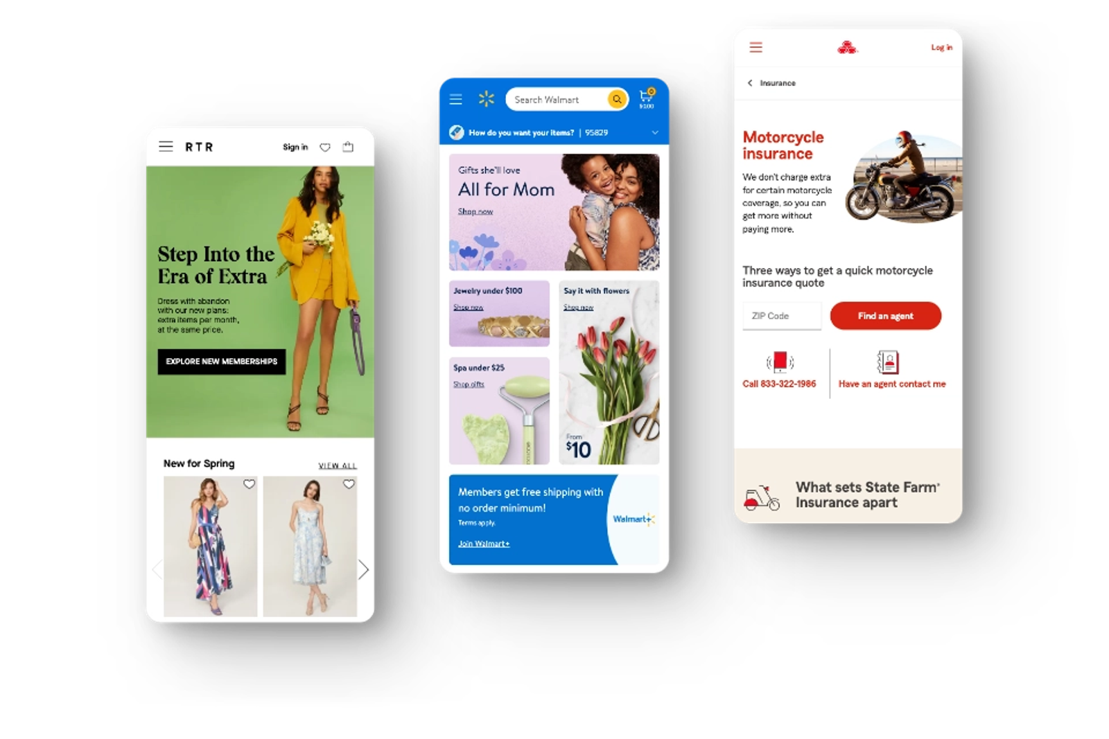
- Walmart reported a substantial rise in orders from phones after rebuilding its site, alongside a measurable lift in overall conversion.
- Shutterfly reported higher conversion and higher revenue per visitor on phones after optimizing for speed and experience.
- State Farm reported a large increase in quote requests after making its small-screen experience easier to complete.
Treat these as directional. They come from an era when the starting point was very poor, so the gains were correspondingly large. Your improvement from a competent site to an excellent one will be smaller and still worth having, because it compounds across every visit.
Mobile-First Design Examples Worth Copying
You do not need a case study to see this working. Three patterns show up on every well-built small-screen site.
The sticky action bar. A single button pinned to the bottom of the screen, in thumb reach, carrying the page's one job: book, call, add to cart. It disappears on desktop because the desktop layout has room for it inline. This is mobile website design at its most literal, and it is the highest-return change most service businesses can make.
The collapsed section. Long content grouped under headings a visitor can open. All the text stays in the markup, so search engines still read it, while the small screen shows a scannable index instead of a wall. Designing for small screens first produces this structure naturally, because you were forced to rank the sections.
The reduced form. Three fields on the phone and three fields on the desktop, because the mobile constraint set the standard for both. Every business that starts wide adds fields it does not need, and every one that starts narrow discovers it never needed them.
The common thread across these mobile-first design examples is that the small version made the large one better, which is the argument for the whole method.
When Mobile-First Is Not the Best Fit
There are cases where starting small is the wrong call.
- Data-dense applications. Dashboards, editors and analysis tools are used on large screens. Design them for the screen where the work happens, then decide what the phone version is for.
- Products with genuinely desktop audiences. Some specialist software is used exclusively at a desk. Check your split of mobile and desktop traffic before assuming.
- Complex configuration flows. Some tasks need room. It is better to design them properly for desktop and make the mobile path a deliberate subset.
Even then, the discipline is worth borrowing. Ask what the smallest useful version of the screen would contain, and you will usually find the desktop layout has more on it than it needs. Working from mobile to desktop is a habit, not a rule, and it applies to product design as much as to a website.
Questions About Mobile-First Design
What is mobile-first design?
It is a design approach that starts with the smallest screen and expands upward. Mobile first design defines what a mobile user needs, builds that first and then adds for larger screens, rather than stripping down from a desktop layout.
What is the difference between mobile-first and responsive design?
Responsive design is the technique of adapting a layout to any screen size. Mobile-first is the order you work in. A responsive site can be built either way, and using a mobile-first approach is simply the direction that produces a better experience on mobile.
Is mobile-first design still relevant?
Yes, though it is now a baseline rather than an advantage. The differentiators today are speed, clarity and how few steps a mobile visitor needs to reach a conversation.
Why is mobile-first design important for SEO?
Because Google indexes the mobile version of your site. Content, structured data and performance are all judged on what a phone sees, so the user experience on mobile devices is the one search engines evaluate.
What are the mobile-first design principles?
Content before layout, touch-friendly targets, a single clear column order, performance treated as a design constraint, progressive enhancement upward, and testing on real devices.
How do I start with mobile-first design on an existing site?
Do not rebuild. Open your analytics, find the three pages that carry the most mobile traffic, and fix those on a real device: speed, tap targets, text size and the path to your primary action. Extend from there. A mobile-first approach enables incremental progress, and applying it to three pages beats a plan for thirty.
Getting the Mobile Experience Right
For an expert-led business the mobile site is not a scaled-down version of the real one. For most of your visitors, it is the real one.
That is how we approach Custom Websites at Dancing Pels: mobile-first website design from the smallest screen up, built to load fast on a phone, and structured so the path to a conversation is short wherever someone opens it. The underlying mechanics are covered in what responsive web design is.
If you have never watched someone try to book you from a phone, book a discovery call and we will do it together.